使用内嵌页面 Page
复用组件(共享 Header 等公共模块)
Page 组件的另一个重要用法是实现组件复用。当多个页面需要共用同一个模块(如 Header、侧边栏等)时,可以将公共模块定义为一个独立的页面或者表单 Layout,然后在各页面中通过 Page 组件引用它,避免重复配置。
示例效果展示
该示例配置一个在移动端多个页面共用同一个 Header 组件,Header 里可以接受父组件传递的 Title,以及自动判断当前网络状况是 Online 还是 Offline。修改 Header 时所有页面同步更新。

配置步骤
1. 创建公共 Header 页面
首先,创建一个独立的页面作为公共 Header。
- 设置左侧的 title 为冒号语法动态引用
:formData.title。 - 在表单 JS 里实现发请求判断用户 Online 或者 Offline 的功能。
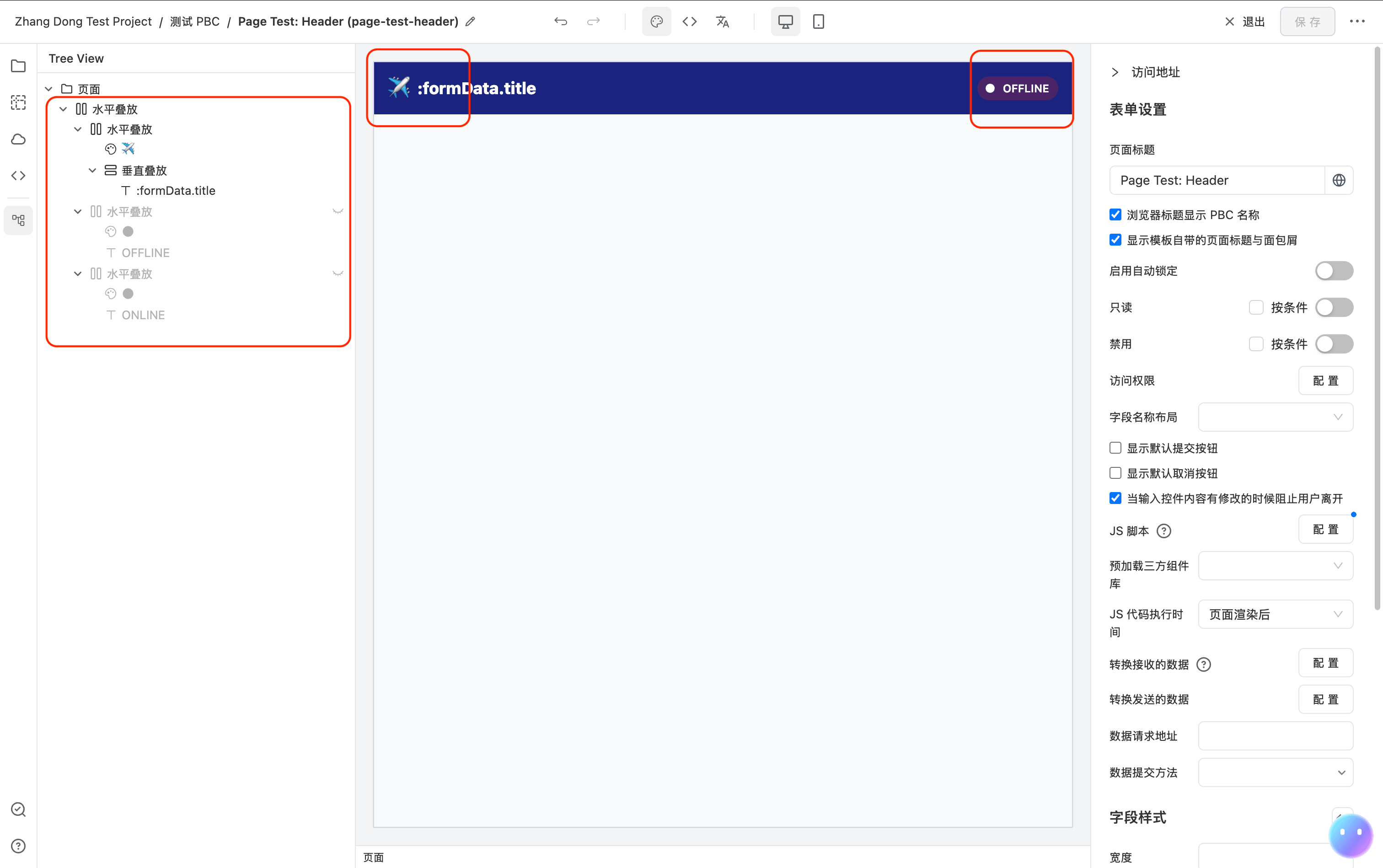
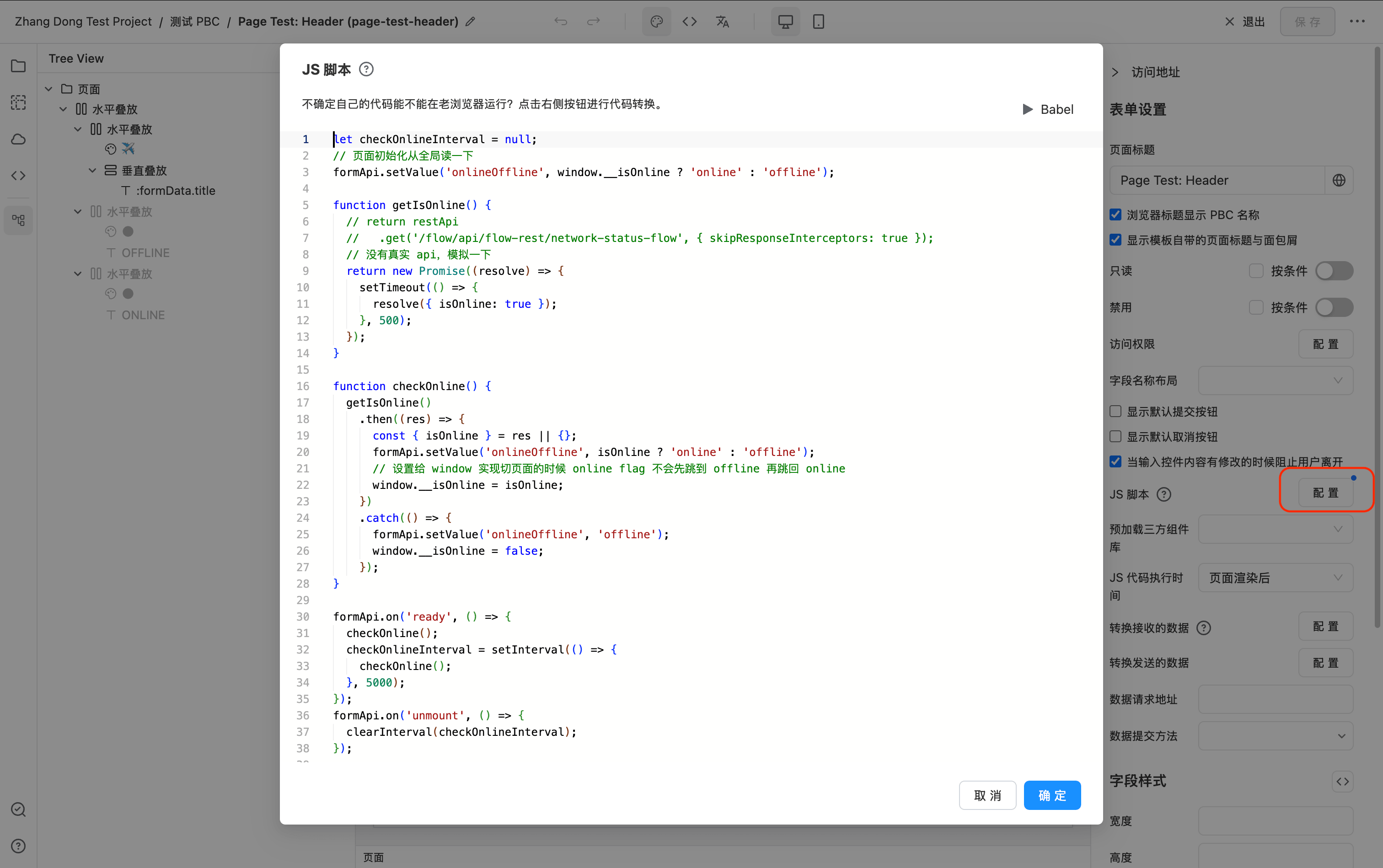
下面是这个页面的完整 JSON 配置:
{
  "form": {
    "title": "Page Test: Header",
    "script": "let checkOnlineInterval = null;\n// 页面初始化从全局读一下\nformApi.setValue('onlineOffline', window.__isOnline ? 'online' : 'offline');\n\nfunction getIsOnline() {\n  // return restApi\n  //   .get('/flow/api/flow-rest/network-status-flow', { skipResponseInterceptors: true });\n  // 没有真实 api,模拟一下\n  return new Promise((resolve) => {\n    setTimeout(() => {\n      resolve({ isOnline: true });\n    }, 500);\n  });\n}\n\nfunction checkOnline() {\n  getIsOnline()\n    .then((res) => {\n      const { isOnline } = res || {};\n      formApi.setValue('onlineOffline', isOnline ? 'online' : 'offline');\n      // 设置给 window 实现切页面的时候 online flag 不会先跳到 offline 再跳回 online\n      window.__isOnline = isOnline;\n    })\n    .catch(() => {\n      formApi.setValue('onlineOffline', 'offline');\n      window.__isOnline = false;\n    });\n}\n\nformApi.on('ready', () => {\n  checkOnline();\n  checkOnlineInterval = setInterval(() => {\n    checkOnline();\n  }, 5000);\n});\nformApi.on('unmount', () => {\n  clearInterval(checkOnlineInterval);\n});\n"
  },
  "fields": [
    {
      "component": "Stack",
      "componentProps": {
        "flexDirection": "row",
        "justifyContent": "space-between",
        "alignItems": "center"
      },
      "fields": [
        {
          "component": "Stack",
          "componentProps": {
            "flexDirection": "row",
            "alignItems": "center"
          },
          "fields": [
            {
              "component": "Icon",
              "componentProps": {
                "name": "✈️",
                "size": 24
              }
            },
            {
              "component": "Stack",
              "componentProps": {
                "flexDirection": "column",
                "justifyContent": "center",
                "gap": 0
              },
              "fields": [
                {
                  "component": "Text",
                  "componentProps": {
                    "content": ":formData.title"
                  },
                  "style": {
                    "fontWeight": 800,
                    "fontSize": 18,
                    "color": "white"
                  }
                }
              ]
            }
          ]
        },
        {
          "component": "Stack",
          "componentProps": {
            "flexDirection": "row",
            "alignItems": "center"
          },
          "fields": [
            {
              "component": "Icon",
              "componentProps": {
                "name": "material:circle-rounded",
                "size": 12
              },
              "style": {
                "color": "white"
              }
            },
            {
              "component": "Text",
              "componentProps": {
                "content": "OFFLINE"
              },
              "style": {
                "color": "white",
                "fontWeight": 600,
                "fontSize": 12
              }
            }
          ],
          "style": {
            "background": "#4a2466",
            "borderRadius": 30,
            "padding": "4px 10px 4px 8px"
          },
          "hidden": {
            "dataPredicate": {
              "operator": "AND",
              "conditions": [
                {
                  "dataField": "onlineOffline",
                  "condition": "equals",
                  "value": "online"
                }
              ]
            }
          }
        },
        {
          "component": "Stack",
          "componentProps": {
            "flexDirection": "row",
            "alignItems": "center"
          },
          "fields": [
            {
              "component": "Icon",
              "componentProps": {
                "name": "material:circle-rounded",
                "size": 12
              },
              "style": {
                "color": "white"
              }
            },
            {
              "component": "Text",
              "componentProps": {
                "content": "ONLINE"
              },
              "style": {
                "color": "white",
                "fontWeight": 600,
                "fontSize": 12
              }
            }
          ],
          "style": {
            "background": "green",
            "borderRadius": 30,
            "padding": "4px 10px 4px 8px"
          },
          "hidden": {
            "dataPredicate": {
              "operator": "AND",
              "conditions": [
                {
                  "dataField": "onlineOffline",
                  "condition": "equals",
                  "value": "online"
                }
              ]
            },
            "valueIfPositive": false,
            "valueIfNegative": true
          }
        }
      ],
      "style": {
        "background": "#1a237e",
        "zIndex": "var(--max-z-index)",
        "padding": 15,
        "position": "sticky",
        "top": 0
      }
    }
  ]
}
2. 在目标页面中添加 Page 组件
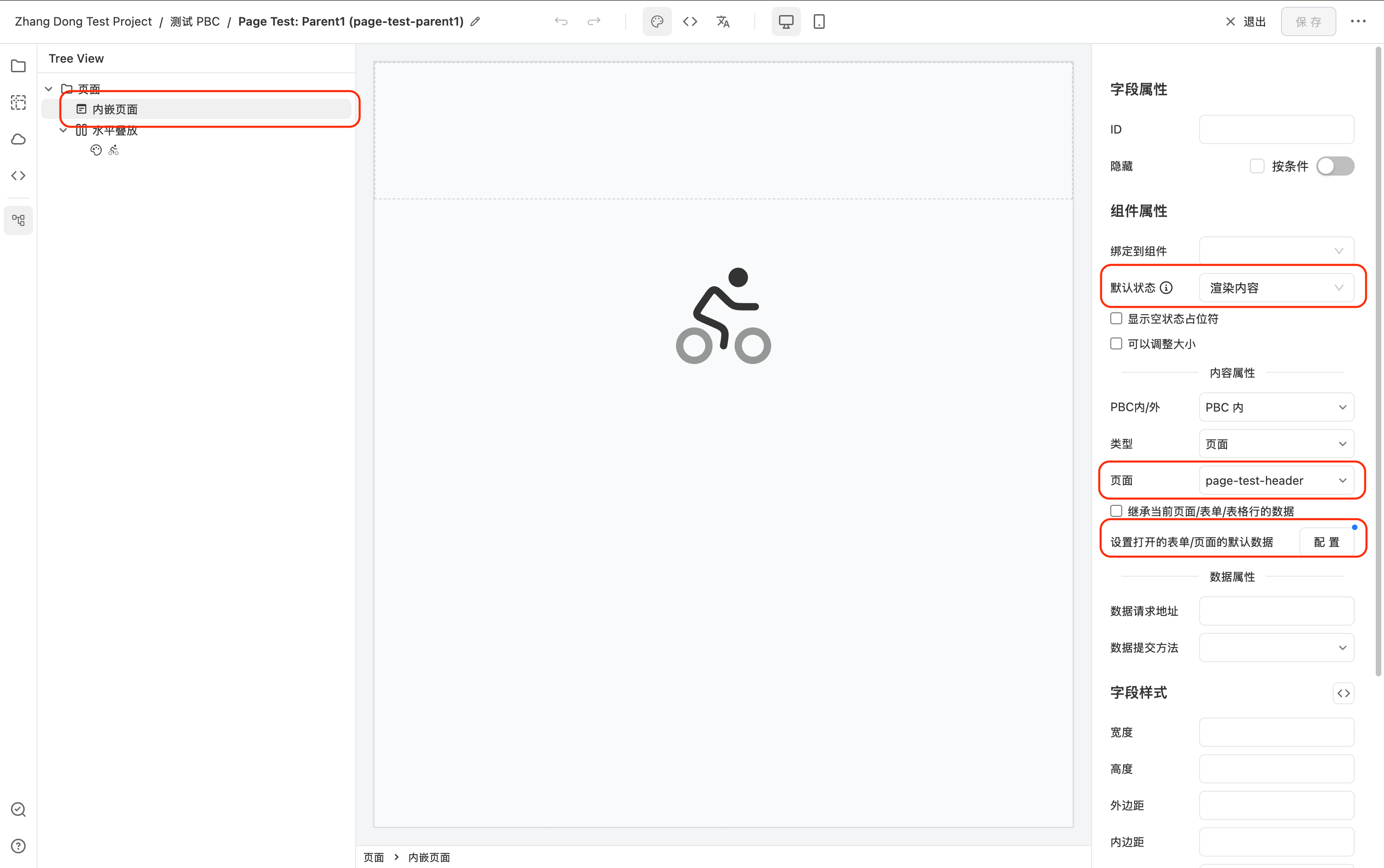
在需要使用公共 Header 的页面中,添加一个 Page 组件,放置在页面顶部。
- 选中 Page 组件,在设置面板中配置
openFormProps,指定要引用的 Header 页面. - 默认 Page 组件处于 empty 状态,需要将
empty设为false,使其直接渲染引用的表单内容。 - 在 设置打开的表单/页面的默认数据 里设置默认数据
{ "title": "Parent Page 1 Header" }
3. 在其他页面重复步骤 2
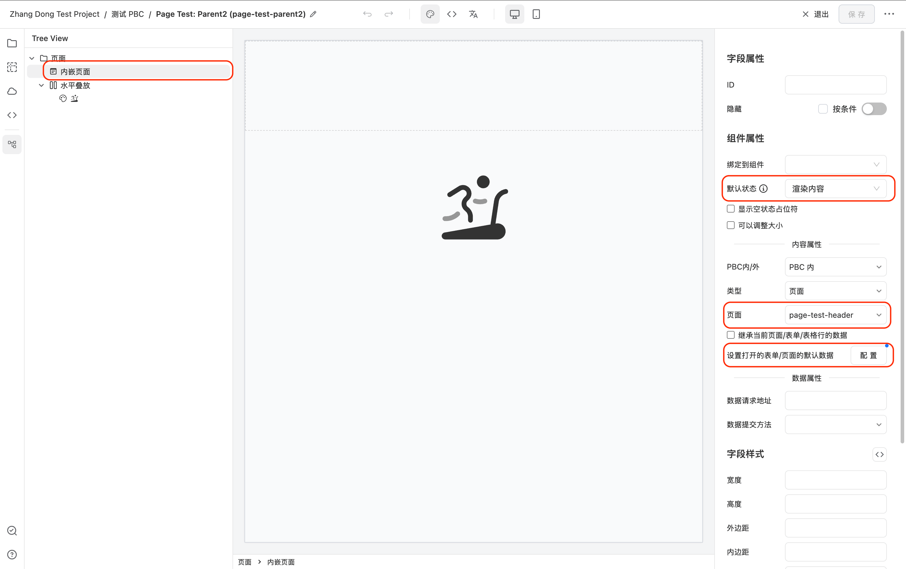
在其他需要相同 Header 的页面中,同样添加 Page 组件并配置相同的 openFormProps,即可实现多页面共用一个 Header。
- 在 设置打开的表单/页面的默认数据 里设置默认数据
{ "title": "Parent Page 2 Header" }
4. 最终效果
所有配置了该 Page 组件的页面都会渲染同一个 Header 表单。后续如需修改 Header,只需修改一处,所有引用页面自动生效。
Header 组件会显示不同调用方传递给他的 title,同时自动发请求显示用户是 Online 或者 Offline。

绑定到可编辑表格
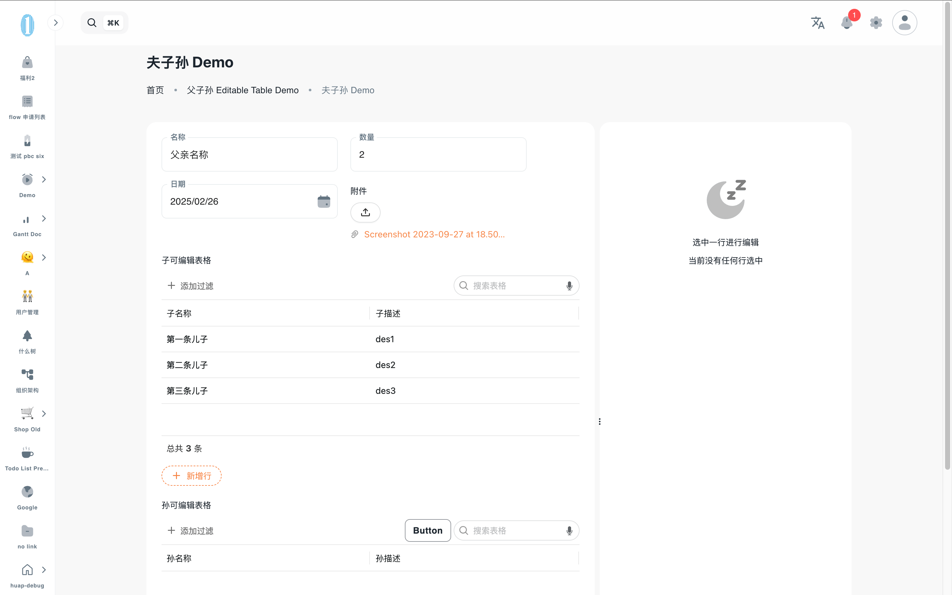
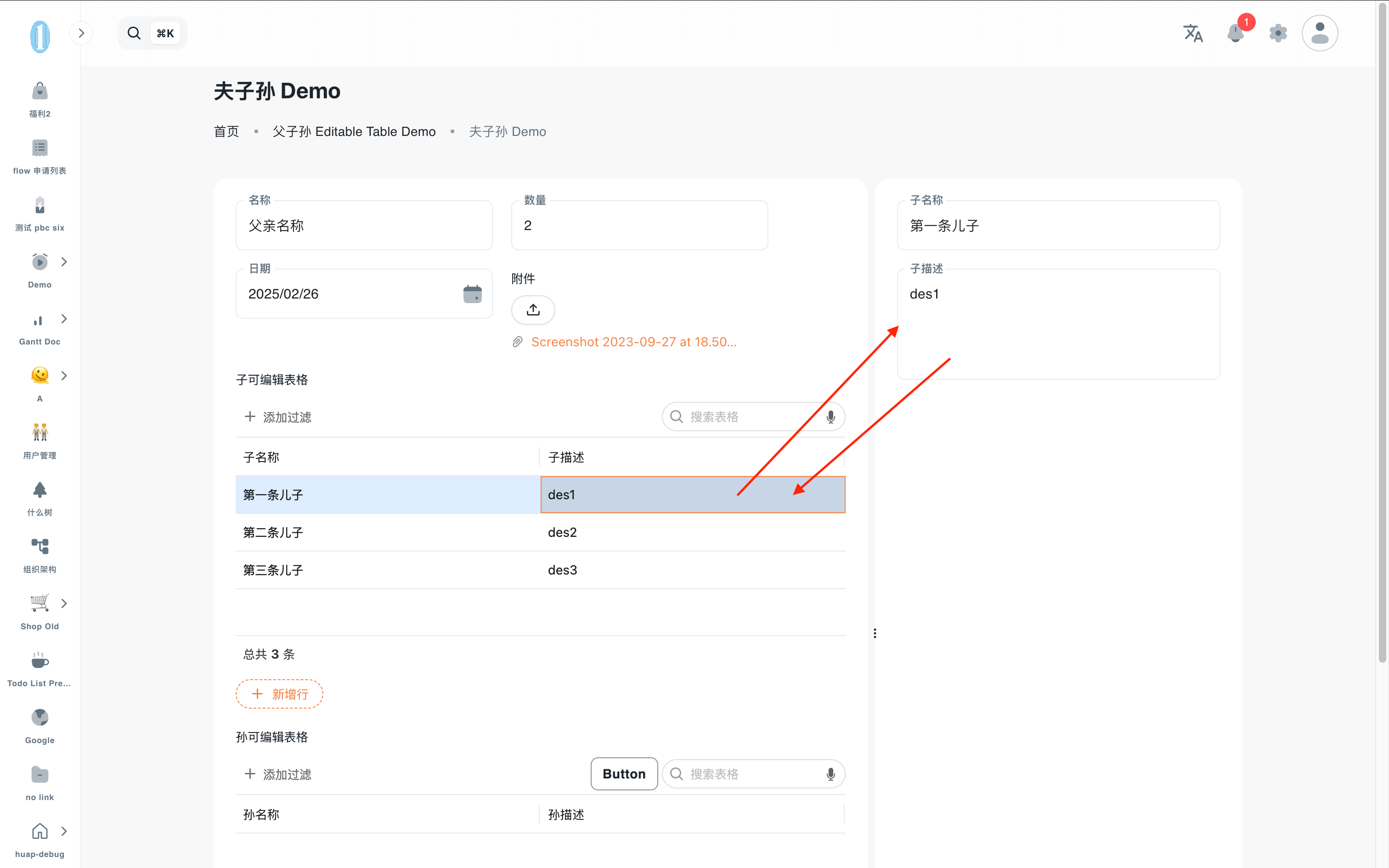
Page 可通过简单配置实现如下效果:
选中可编辑表格行数据,右侧编辑面板显示对应的子表单进行编辑。
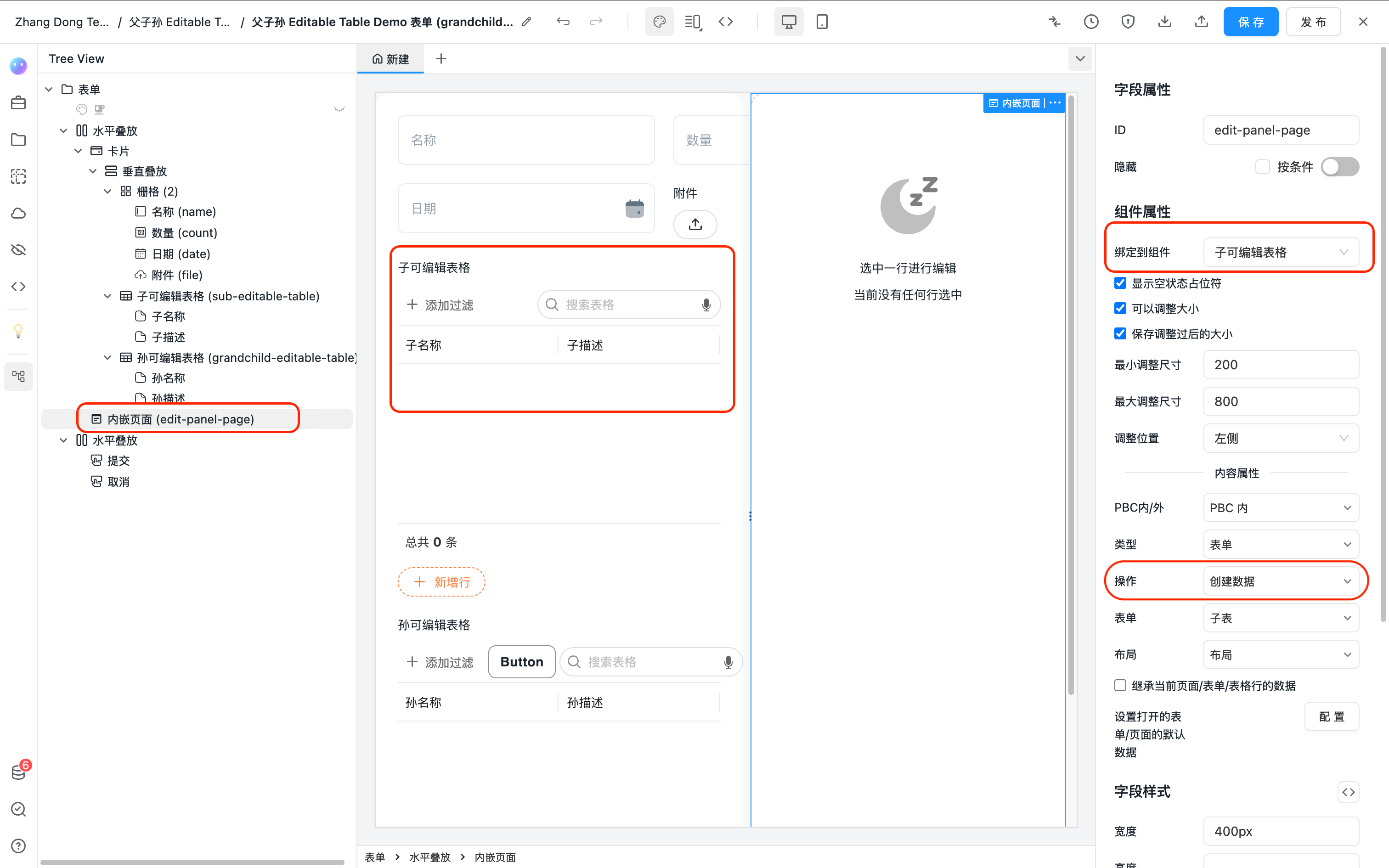
配置界面如下:
如下是这个示例表单的完整配置 json,可以直接复制到表单设计器查看演示效果。
{
  "form": {
    "defaultSubmitButton": false,
    "defaultCancelButton": false,
    "labelLayout": "vertical",
    "title": "Page Demo"
  },
  "fields": [
    {
      "component": "Stack",
      "componentProps": {
        "flexDirection": "row"
      },
      "fields": [
        {
          "component": "Card",
          "style": {
            "flex": 1,
            "minWidth": "400px"
          },
          "fields": [
            {
              "component": "Stack",
              "componentProps": {
                "flexDirection": "column",
                "gap": 20
              },
              "fields": [
                {
                  "component": "Grid",
                  "fields": [
                    {
                      "id": "name",
                      "title": "名称",
                      "title_i18n_en-US": "Name",
                      "component": "Input",
                      "validation": {
                        "maxLength": 200
                      }
                    },
                    {
                      "id": "count",
                      "title": "数量",
                      "component": "NumberPicker"
                    },
                    {
                      "id": "date",
                      "title": "日期",
                      "component": "DatePicker"
                    },
                    {
                      "id": "file",
                      "title": "附件",
                      "component": "Upload",
                      "componentProps": {
                        "listType": "text"
                      }
                    }
                  ],
                  "componentProps": {
                    "colNumber": 2,
                    "columnGap": 20,
                    "rowGap": 20
                  },
                  "style": {
                    "width": "600px"
                  }
                },
                {
                  "component": "EditableTable",
                  "id": "sub-editable-table",
                  "title": "子可编辑表格",
                  "fieldConfig": {
                    "formEntityToken": "sub-table-form",
                    "pbcToken": "grandchild-editable-table",
                    "relations": [
                      {
                        "colId": "parentDataId",
                        "filterType": "text",
                        "type": "equals",
                        "filter": "$CURRENT_FORM_DATA_ID"
                      }
                    ]
                  },
                  "componentProps": {
                    "columnDefs": [
                      {
                        "type": "TEXT_COLUMN",
                        "colId": "name",
                        "field": "name",
                        "headerName": "子名称",
                        "editable": true,
                        "cellEditorParams": {
                          "validation": {
                            "maxLength": 200
                          }
                        }
                      },
                      {
                        "type": "TEXTAREA_COLUMN",
                        "colId": "description",
                        "field": "description",
                        "headerName": "子描述",
                        "editable": true,
                        "cellEditorParams": {}
                      }
                    ]
                  }
                }
              ]
            }
          ]
        },
        {
          "id": "edit-panel-page",
          "component": "Page",
          "componentProps": {
            "//bindComponentId": "sub-editable-table",
            "openFormProps": {
              "formType": "ENTITY",
              "pbcToken": "grandchild-editable-table",
              "formEntityToken": "sub-table-form",
              "formEntityLayoutToken": "default",
              "FormRendererProps": {}
            },
            "emptyFields": [
              {
                "component": "Stack",
                "componentProps": {
                  "flexDirection": "column",
                  "alignItems": "center",
                  "justifyContent": "center"
                },
                "fields": [
                  {
                    "component": "Icon",
                    "componentProps": {
                      "name": "solar:moon-sleep-bold-duotone",
                      "size": 72,
                      "color": "rgb(0 0 0 / 50%)"
                    },
                    "style": {
                      "margin": "64px 0 12px 0"
                    }
                  },
                  {
                    "component": "Text",
                    "componentProps": {
                      "content": "选中一行进行编辑"
                    }
                  },
                  {
                    "component": "Text",
                    "componentProps": {
                      "content": "当前没有任何行选中"
                    },
                    "style": {
                      "color": "rgb(00"
                    }
                  }
                ],
                "style": {}
              }
            ],
            "ResizableProps": {
              "maxGap": 700,
              "min": 200
            },
            "empty": true,
            "bindComponentId": "sub-editable-table"
          },
          "style": {
            "width": "400px",
            "padding": "24px",
            "background": "white",
            "borderRadius": "var(--card-radius)"
          }
        }
      ]
    },
    {
      "component": "Stack",
      "componentProps": {
        "justifyContent": "flex-end"
      },
      "style": {
        "marginTop": 12
      },
      "fields": [
        {
          "component": "Button",
          "componentProps": {
            "content": "提交",
            "type": "primary",
            "action": {
              "type": "submit",
              "successAction": {
                "type": "cancel"
              }
            }
          }
        },
        {
          "component": "Button",
          "componentProps": {
            "content": "取消",
            "action": {
              "type": "cancel"
            }
          }
        }
      ]
    }
  ]
}
通过 API 自定义动作
如果默认设置选项的 "绑定到可编辑表格" 行为不满足需求,可以通过 Page 组件的 JS API 自定义其行为。
如下示例 JS 代码完整的实现了上述组件自带的 "绑定到可编辑表格" 行为。
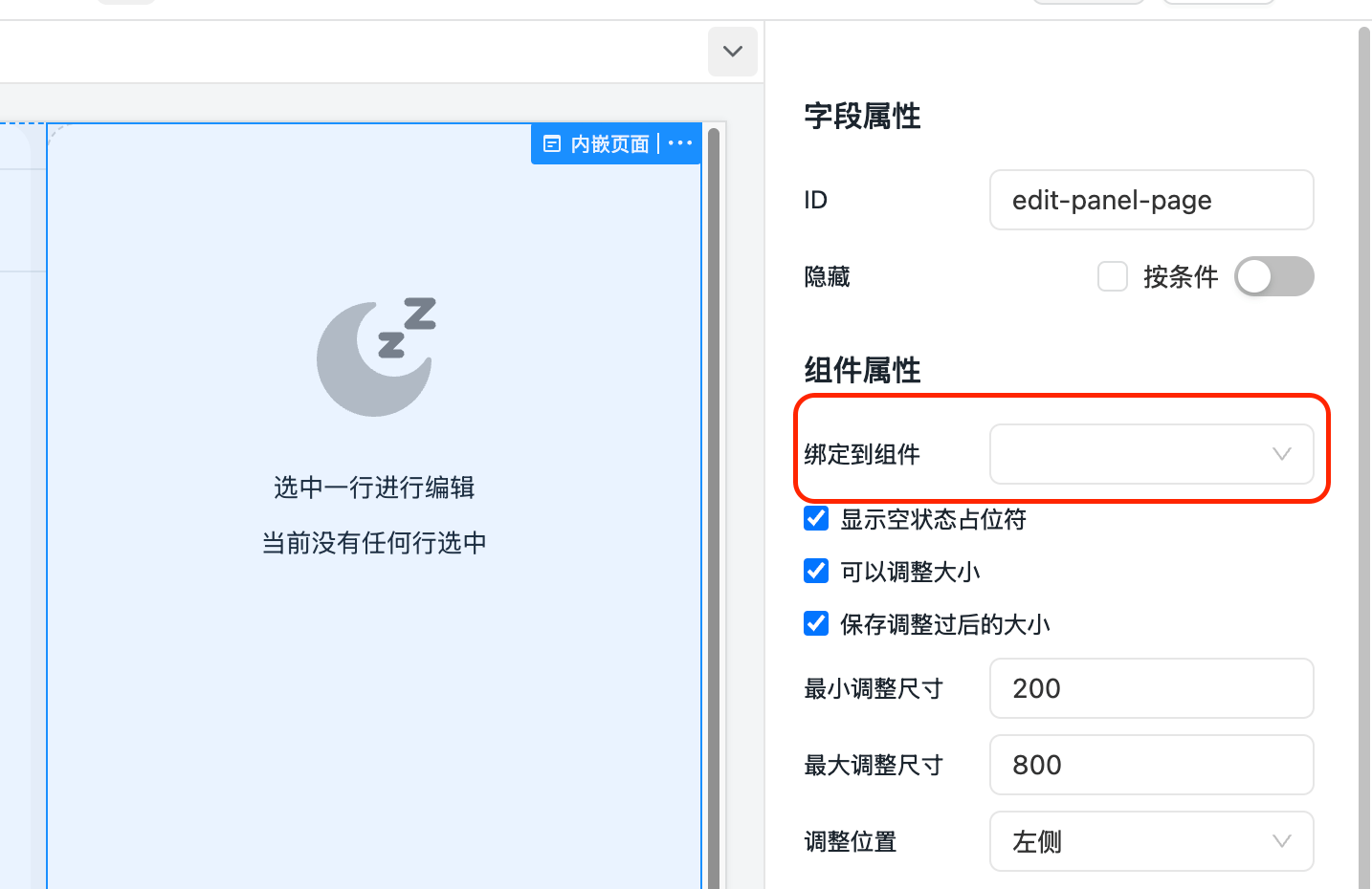
- 取消表单设计器里的
Page组件设置项 绑定到组件。
- 将如下 JS 代码复制到表单的 JS 代码里,修改对应代码则可以修改对应行为。
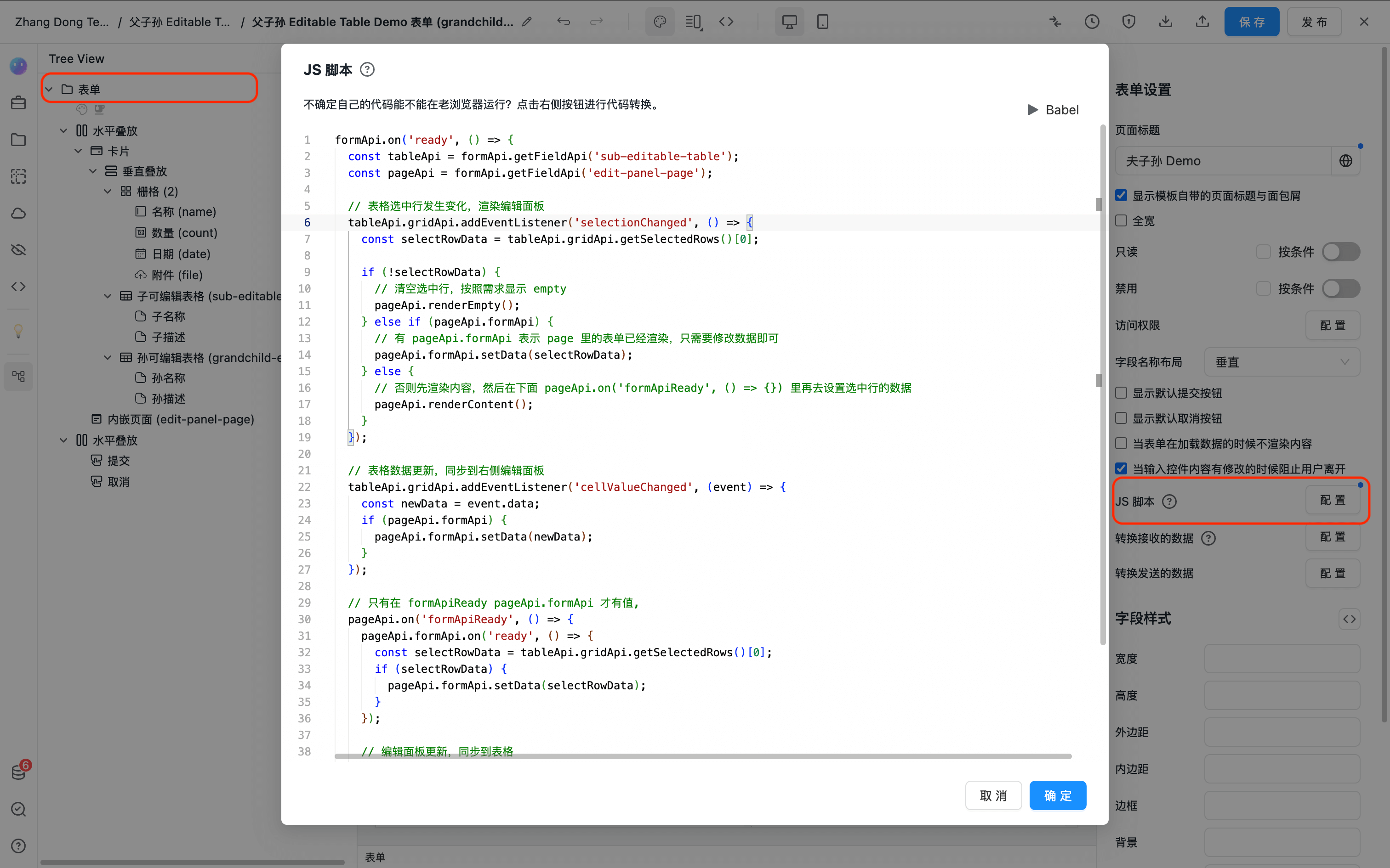
formApi.on('ready', () => {
  const tableApi = formApi.getFieldApi('sub-editable-table');
  const pageApi = formApi.getFieldApi('edit-panel-page');

  // 表格选中行发生变化,渲染编辑面板
  tableApi.gridApi.addEventListener('selectionChanged', () => {
    const selectRowData = tableApi.gridApi.getSelectedRows()[0];

    if (!selectRowData) {
      // 清空选中行,按照需求显示 empty
      pageApi.renderEmpty();
    } else if (pageApi.formApi) {
      // 有 pageApi.formApi 表示 page 里的表单已经渲染,只需要修改数据即可
      pageApi.formApi.setData(selectRowData);
    } else {
      // 否则先渲染内容,然后在下面 pageApi.on('formApiReady', () => {}) 里再去设置选中行的数据
      pageApi.renderContent();
    }
  });

  // 表格数据更新,同步到右侧编辑面板
  tableApi.gridApi.addEventListener('cellValueChanged', (event) => {
    const newData = event.data;
    if (pageApi.formApi) {
      pageApi.formApi.setData(newData);
    }
  });

  // 只有在 formApiReady pageApi.formApi 才有值,
  pageApi.on('formApiReady', () => {
    pageApi.formApi.on('ready', () => {
      const selectRowData = tableApi.gridApi.getSelectedRows()[0];
      if (selectRowData) {
        pageApi.formApi.setData(selectRowData);
      }
    });

    // 编辑面板更新,同步到表格
    // pageApi.renderContent() 可能会导致 pageApi.formApi 发生变化,所以每次 formApiReady 过后都需要重新绑定 change 事件
    pageApi.formApi.on('change', (newData) => {
      tableApi.updateRow(newData);
    });
  });
});
API
完整的 Page API 参考在此处 Page