Using Page
Reusing Components (Sharing Header and Other Common Modules)
Another important use of the Page component is to enable component reuse. When multiple pages need to share the same module (such as Header, sidebar, etc.), you can define the common module as an independent page or form layout, then reference it via the Page component in each page to avoid repetitive configuration.
Example Demo
This example configures a shared Header component across multiple mobile pages. The Header accepts a Title passed from the parent component and automatically detects whether the current network status is Online or Offline. When the Header is modified, all pages update simultaneously.

Configuration Steps
1. Create a Shared Header Page
First, create an independent page as the shared Header.
- Set the left-side title to use colon syntax for dynamic reference:
:formData.title. - Implement the logic for checking whether the user is Online or Offline in the form JS.
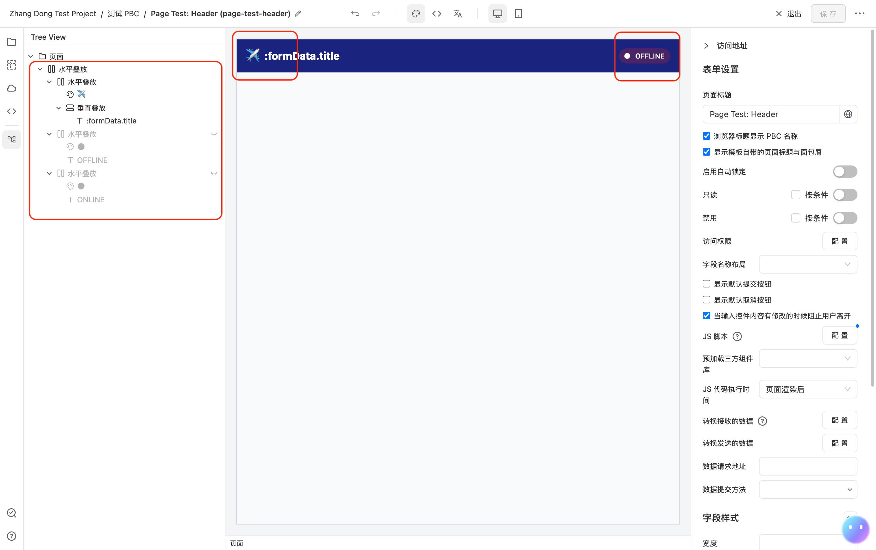
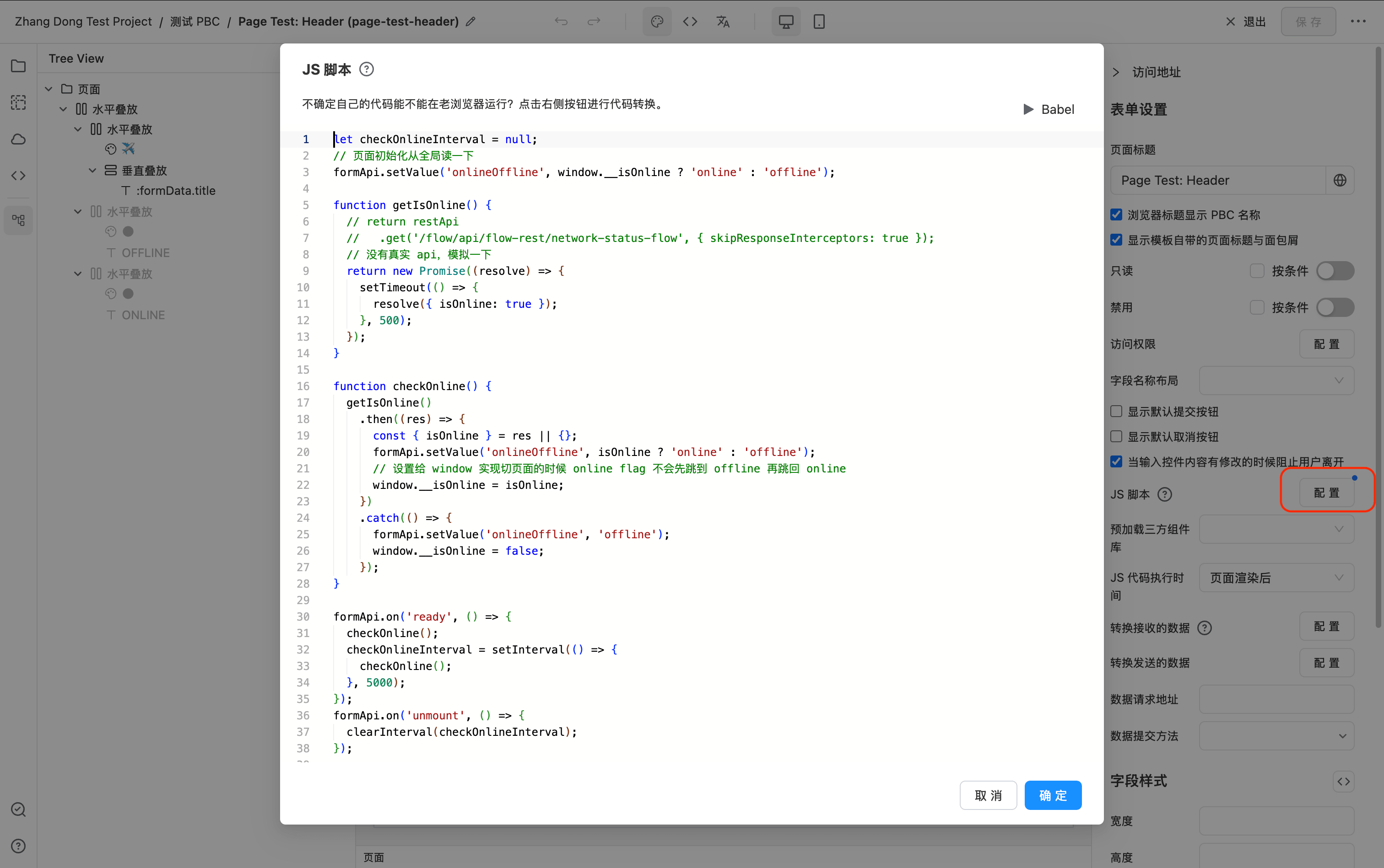
Below is the complete JSON configuration for this page:
{
  "form": {
    "title": "Page Test: Header",
    "script": "let checkOnlineInterval = null;\n// Read from global on page initialization\nformApi.setValue('onlineOffline', window.__isOnline ? 'online' : 'offline');\n\nfunction getIsOnline() {\n  // return restApi\n  //   .get('/flow/api/flow-rest/network-status-flow', { skipResponseInterceptors: true });\n  // No real API, simulating\n  return new Promise((resolve) => {\n    setTimeout(() => {\n      resolve({ isOnline: true });\n    }, 500);\n  });\n}\n\nfunction checkOnline() {\n  getIsOnline()\n    .then((res) => {\n      const { isOnline } = res || {};\n      formApi.setValue('onlineOffline', isOnline ? 'online' : 'offline');\n      // Set to window so the online flag won't flash to offline when switching pages\n      window.__isOnline = isOnline;\n    })\n    .catch(() => {\n      formApi.setValue('onlineOffline', 'offline');\n      window.__isOnline = false;\n    });\n}\n\nformApi.on('ready', () => {\n  checkOnline();\n  checkOnlineInterval = setInterval(() => {\n    checkOnline();\n  }, 5000);\n});\nformApi.on('unmount', () => {\n  clearInterval(checkOnlineInterval);\n});\n"
  },
  "fields": [
    {
      "component": "Stack",
      "componentProps": {
        "flexDirection": "row",
        "justifyContent": "space-between",
        "alignItems": "center"
      },
      "fields": [
        {
          "component": "Stack",
          "componentProps": {
            "flexDirection": "row",
            "alignItems": "center"
          },
          "fields": [
            {
              "component": "Icon",
              "componentProps": {
                "name": "✈️",
                "size": 24
              }
            },
            {
              "component": "Stack",
              "componentProps": {
                "flexDirection": "column",
                "justifyContent": "center",
                "gap": 0
              },
              "fields": [
                {
                  "component": "Text",
                  "componentProps": {
                    "content": ":formData.title"
                  },
                  "style": {
                    "fontWeight": 800,
                    "fontSize": 18,
                    "color": "white"
                  }
                }
              ]
            }
          ]
        },
        {
          "component": "Stack",
          "componentProps": {
            "flexDirection": "row",
            "alignItems": "center"
          },
          "fields": [
            {
              "component": "Icon",
              "componentProps": {
                "name": "material:circle-rounded",
                "size": 12
              },
              "style": {
                "color": "white"
              }
            },
            {
              "component": "Text",
              "componentProps": {
                "content": "OFFLINE"
              },
              "style": {
                "color": "white",
                "fontWeight": 600,
                "fontSize": 12
              }
            }
          ],
          "style": {
            "background": "#4a2466",
            "borderRadius": 30,
            "padding": "4px 10px 4px 8px"
          },
          "hidden": {
            "dataPredicate": {
              "operator": "AND",
              "conditions": [
                {
                  "dataField": "onlineOffline",
                  "condition": "equals",
                  "value": "online"
                }
              ]
            }
          }
        },
        {
          "component": "Stack",
          "componentProps": {
            "flexDirection": "row",
            "alignItems": "center"
          },
          "fields": [
            {
              "component": "Icon",
              "componentProps": {
                "name": "material:circle-rounded",
                "size": 12
              },
              "style": {
                "color": "white"
              }
            },
            {
              "component": "Text",
              "componentProps": {
                "content": "ONLINE"
              },
              "style": {
                "color": "white",
                "fontWeight": 600,
                "fontSize": 12
              }
            }
          ],
          "style": {
            "background": "green",
            "borderRadius": 30,
            "padding": "4px 10px 4px 8px"
          },
          "hidden": {
            "dataPredicate": {
              "operator": "AND",
              "conditions": [
                {
                  "dataField": "onlineOffline",
                  "condition": "equals",
                  "value": "online"
                }
              ]
            },
            "valueIfPositive": false,
            "valueIfNegative": true
          }
        }
      ],
      "style": {
        "background": "#1a237e",
        "zIndex": "var(--max-z-index)",
        "padding": 15,
        "position": "sticky",
        "top": 0
      }
    }
  ]
}
2. Add the Page Component to the Target Page
In the page that needs to use the shared Header, add a Page component and place it at the top of the page.
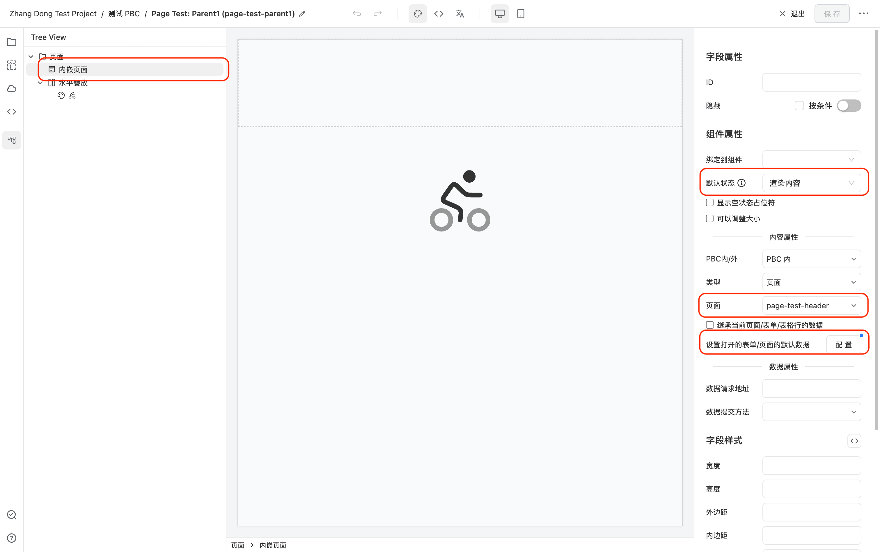
- Select the Page component, then configure
openFormPropsin the settings panel to specify the Header page to reference. - By default, the Page component is in an empty state. Set
emptytofalseto render the referenced form content directly. - In Set default data for the opened form/page, set the default data to
{ "title": "Parent Page 1 Header" }
3. Repeat Step 2 on Other Pages
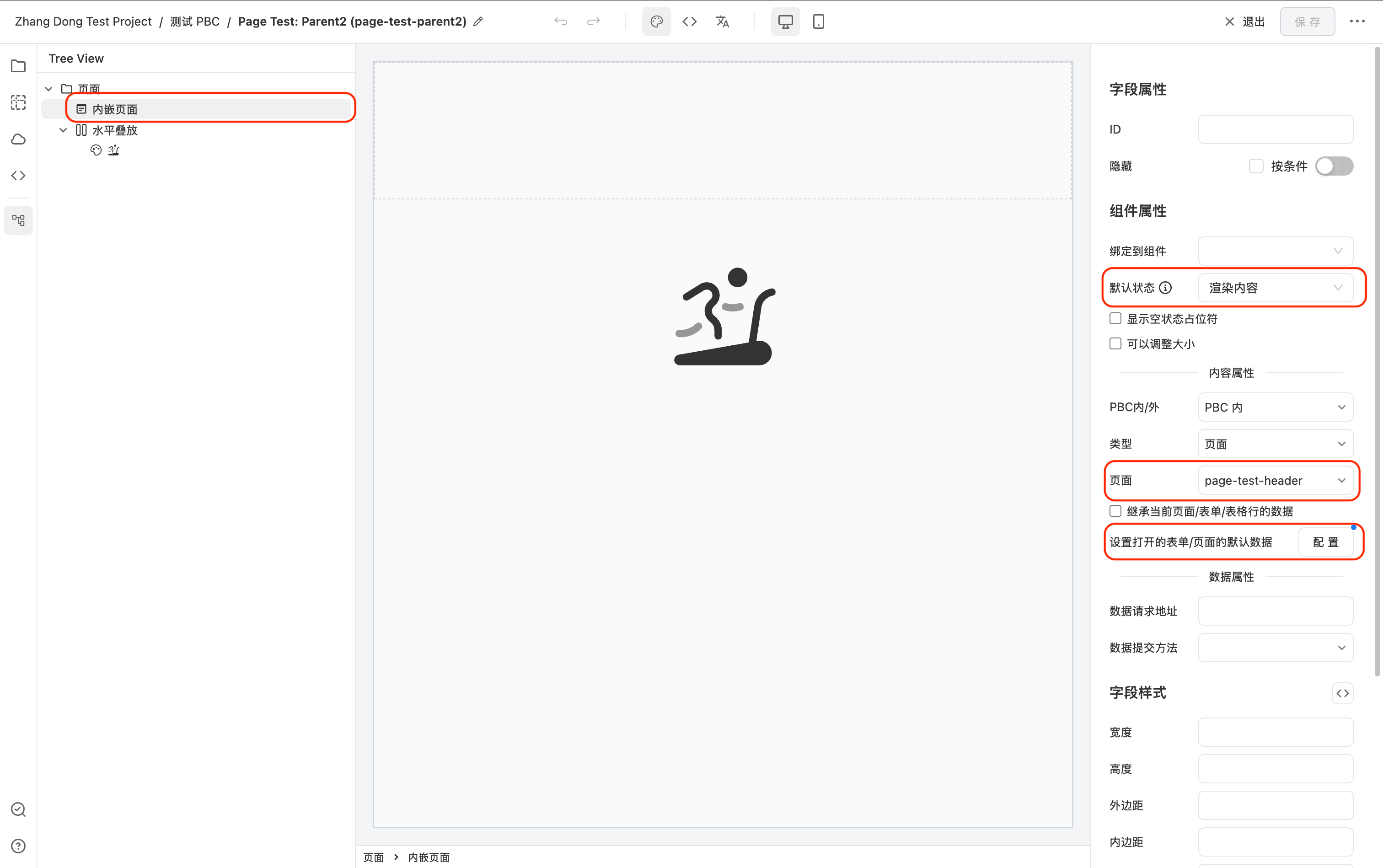
On other pages that need the same Header, add a Page component and configure the same openFormProps to share the Header across multiple pages.
- In Set default data for the opened form/page, set the default data to
{ "title": "Parent Page 2 Header" }
4. Final Result
All pages configured with the Page component will render the same Header form. If the Header needs to be modified later, you only need to change it in one place, and all referencing pages will update automatically.
The Header component displays different titles passed by different callers, and automatically sends requests to show whether the user is Online or Offline.

Binding to an Editable Table
The Page component can achieve the following effect with simple configuration:
Select a row in the editable table, and the right-side edit panel displays the corresponding sub-form for editing.
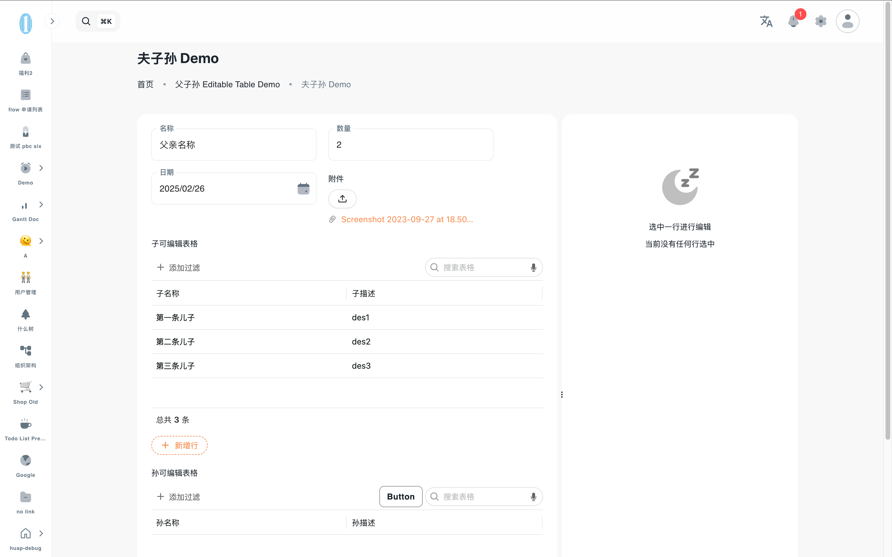
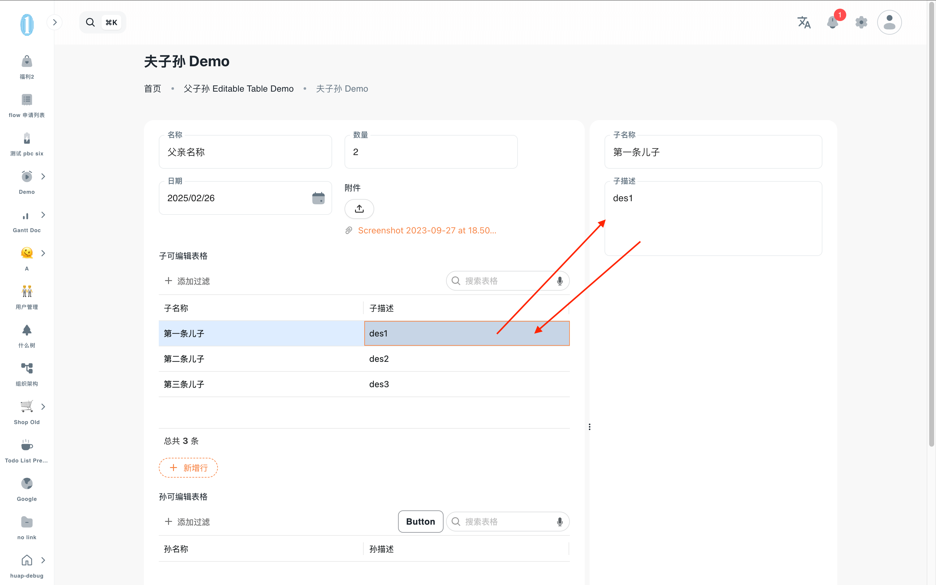
The configuration interface is as follows:
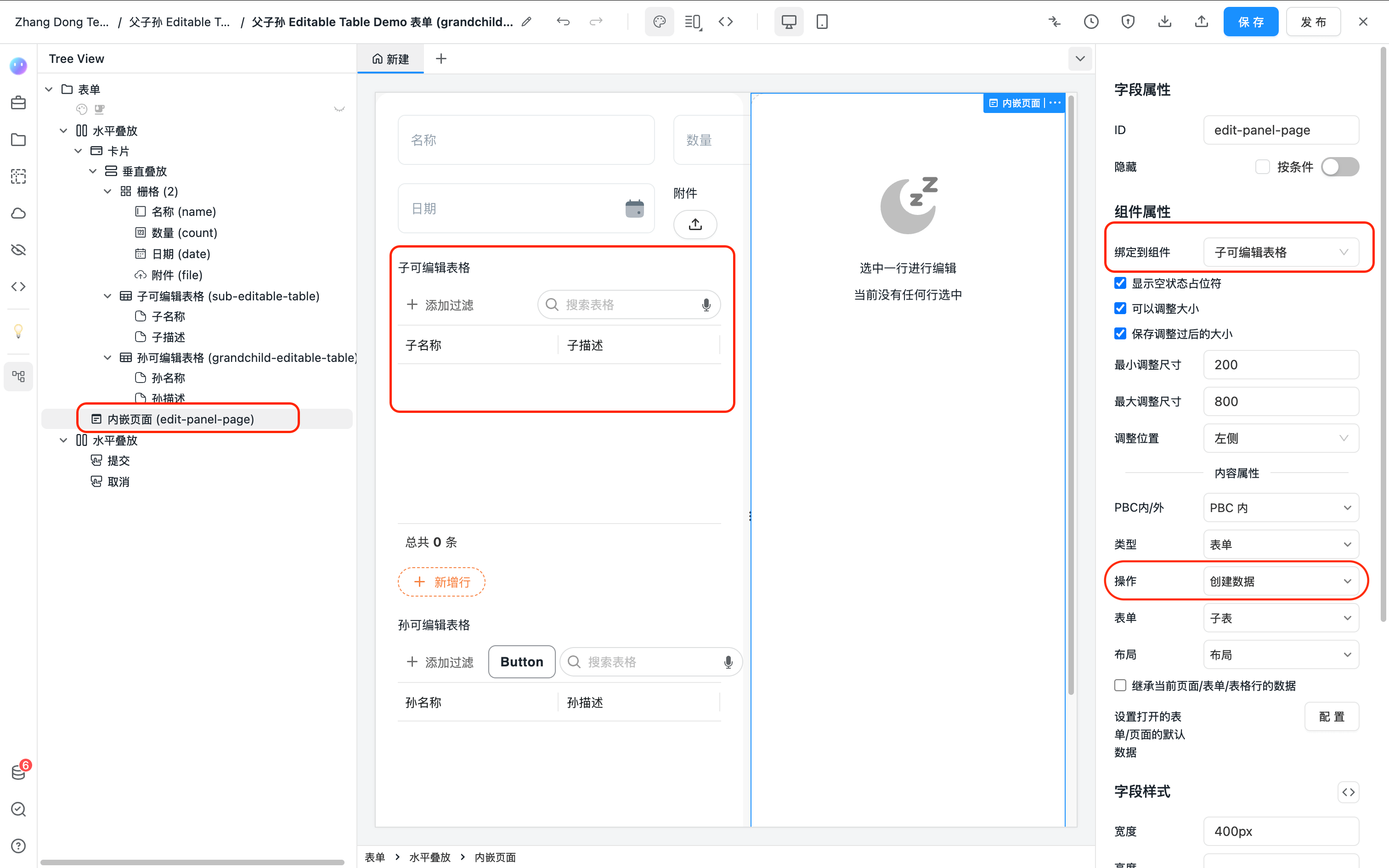
Below is the complete JSON configuration for this example form. You can copy it directly into the form designer to see the demo effect.
{
  "form": {
    "defaultSubmitButton": false,
    "defaultCancelButton": false,
    "labelLayout": "vertical",
    "title": "Page Demo"
  },
  "fields": [
    {
      "component": "Stack",
      "componentProps": {
        "flexDirection": "row"
      },
      "fields": [
        {
          "component": "Card",
          "style": {
            "flex": 1,
            "minWidth": "400px"
          },
          "fields": [
            {
              "component": "Stack",
              "componentProps": {
                "flexDirection": "column",
                "gap": 20
              },
              "fields": [
                {
                  "component": "Grid",
                  "fields": [
                    {
                      "id": "name",
                      "title": "Name",
                      "title_i18n_en-US": "Name",
                      "component": "Input",
                      "validation": {
                        "maxLength": 200
                      }
                    },
                    {
                      "id": "count",
                      "title": "Count",
                      "component": "NumberPicker"
                    },
                    {
                      "id": "date",
                      "title": "Date",
                      "component": "DatePicker"
                    },
                    {
                      "id": "file",
                      "title": "Attachment",
                      "component": "Upload",
                      "componentProps": {
                        "listType": "text"
                      }
                    }
                  ],
                  "componentProps": {
                    "colNumber": 2,
                    "columnGap": 20,
                    "rowGap": 20
                  },
                  "style": {
                    "width": "600px"
                  }
                },
                {
                  "component": "EditableTable",
                  "id": "sub-editable-table",
                  "title": "Sub Editable Table",
                  "fieldConfig": {
                    "formEntityToken": "sub-table-form",
                    "pbcToken": "grandchild-editable-table",
                    "relations": [
                      {
                        "colId": "parentDataId",
                        "filterType": "text",
                        "type": "equals",
                        "filter": "$CURRENT_FORM_DATA_ID"
                      }
                    ]
                  },
                  "componentProps": {
                    "columnDefs": [
                      {
                        "type": "TEXT_COLUMN",
                        "colId": "name",
                        "field": "name",
                        "headerName": "Sub Name",
                        "editable": true,
                        "cellEditorParams": {
                          "validation": {
                            "maxLength": 200
                          }
                        }
                      },
                      {
                        "type": "TEXTAREA_COLUMN",
                        "colId": "description",
                        "field": "description",
                        "headerName": "Sub Description",
                        "editable": true,
                        "cellEditorParams": {}
                      }
                    ]
                  }
                }
              ]
            }
          ]
        },
        {
          "id": "edit-panel-page",
          "component": "Page",
          "componentProps": {
            "//bindComponentId": "sub-editable-table",
            "openFormProps": {
              "formType": "ENTITY",
              "pbcToken": "grandchild-editable-table",
              "formEntityToken": "sub-table-form",
              "formEntityLayoutToken": "default",
              "FormRendererProps": {}
            },
            "emptyFields": [
              {
                "component": "Stack",
                "componentProps": {
                  "flexDirection": "column",
                  "alignItems": "center",
                  "justifyContent": "center"
                },
                "fields": [
                  {
                    "component": "Icon",
                    "componentProps": {
                      "name": "solar:moon-sleep-bold-duotone",
                      "size": 72,
                      "color": "rgb(0 0 0 / 50%)"
                    },
                    "style": {
                      "margin": "64px 0 12px 0"
                    }
                  },
                  {
                    "component": "Text",
                    "componentProps": {
                      "content": "Select a row to edit"
                    }
                  },
                  {
                    "component": "Text",
                    "componentProps": {
                      "content": "No row is currently selected"
                    },
                    "style": {
                      "color": "rgb(00"
                    }
                  }
                ],
                "style": {}
              }
            ],
            "ResizableProps": {
              "maxGap": 700,
              "min": 200
            },
            "empty": true,
            "bindComponentId": "sub-editable-table"
          },
          "style": {
            "width": "400px",
            "padding": "24px",
            "background": "white",
            "borderRadius": "var(--card-radius)"
          }
        }
      ]
    },
    {
      "component": "Stack",
      "componentProps": {
        "justifyContent": "flex-end"
      },
      "style": {
        "marginTop": 12
      },
      "fields": [
        {
          "component": "Button",
          "componentProps": {
            "content": "Submit",
            "type": "primary",
            "action": {
              "type": "submit",
              "successAction": {
                "type": "cancel"
              }
            }
          }
        },
        {
          "component": "Button",
          "componentProps": {
            "content": "Cancel",
            "action": {
              "type": "cancel"
            }
          }
        }
      ]
    }
  ]
}
Customizing Actions via API
If the default "Bind to Editable Table" behavior does not meet your needs, you can customize its behavior using the Page component's JS API.
The following example JS code fully implements the built-in "Bind to Editable Table" behavior described above.
- Uncheck the Bind to Component option in the
Pagecomponent settings in the form designer.
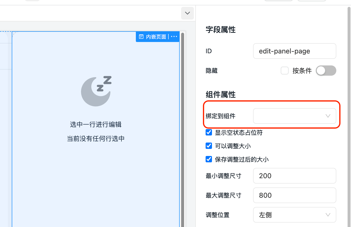
- Copy the following JS code into the form's JS code. Modify the corresponding code to change the behavior as needed.
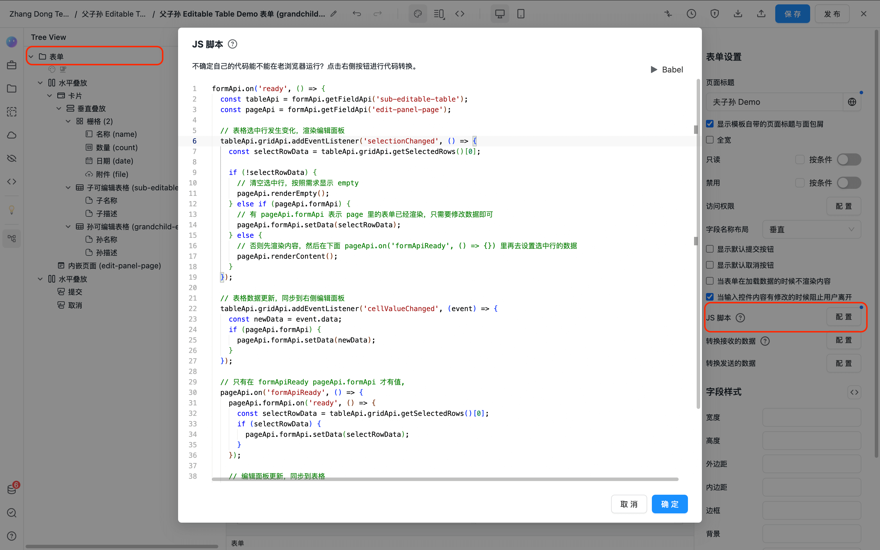
formApi.on('ready', () => {
  const tableApi = formApi.getFieldApi('sub-editable-table');
  const pageApi = formApi.getFieldApi('edit-panel-page');

  // When table selected row changes, render the edit panel
  tableApi.gridApi.addEventListener('selectionChanged', () => {
    const selectRowData = tableApi.gridApi.getSelectedRows()[0];

    if (!selectRowData) {
      // No selected row, show empty state as needed
      pageApi.renderEmpty();
    } else if (pageApi.formApi) {
      // If pageApi.formApi exists, the form inside page is already rendered, just update the data
      pageApi.formApi.setData(selectRowData);
    } else {
      // Otherwise render the content first, then set the selected row data in pageApi.on('formApiReady', () => {}) below
      pageApi.renderContent();
    }
  });

  // When table data updates, sync to the right-side edit panel
  tableApi.gridApi.addEventListener('cellValueChanged', (event) => {
    const newData = event.data;
    if (pageApi.formApi) {
      pageApi.formApi.setData(newData);
    }
  });

  // pageApi.formApi is only available after formApiReady
  pageApi.on('formApiReady', () => {
    pageApi.formApi.on('ready', () => {
      const selectRowData = tableApi.gridApi.getSelectedRows()[0];
      if (selectRowData) {
        pageApi.formApi.setData(selectRowData);
      }
    });

    // Sync edit panel changes back to the table
    // pageApi.renderContent() may change pageApi.formApi, so we need to rebind the change event after each formApiReady
    pageApi.formApi.on('change', (newData) => {
      tableApi.updateRow(newData);
    });
  });
});
API
For the complete Page API reference, see Page