Appearance Configuration
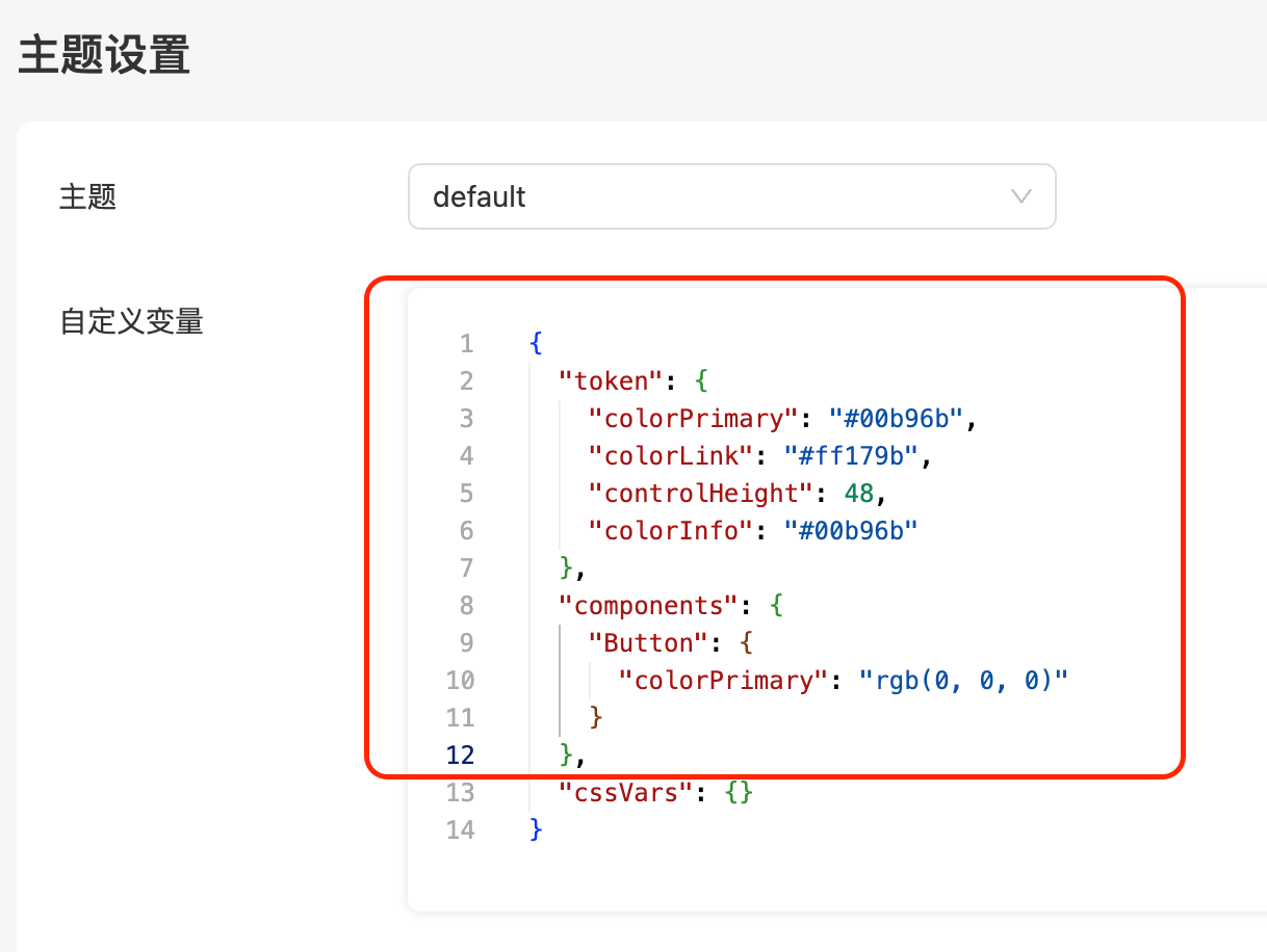
Theme Settings
Component Library Variables
Custom variables are combined with the settings of the Ant Design component library. You can configure the Ant Design component library styles in the Theme Editor copy the configured token and components, and paste them back into the platform's theme settings:
Ant's configuration:
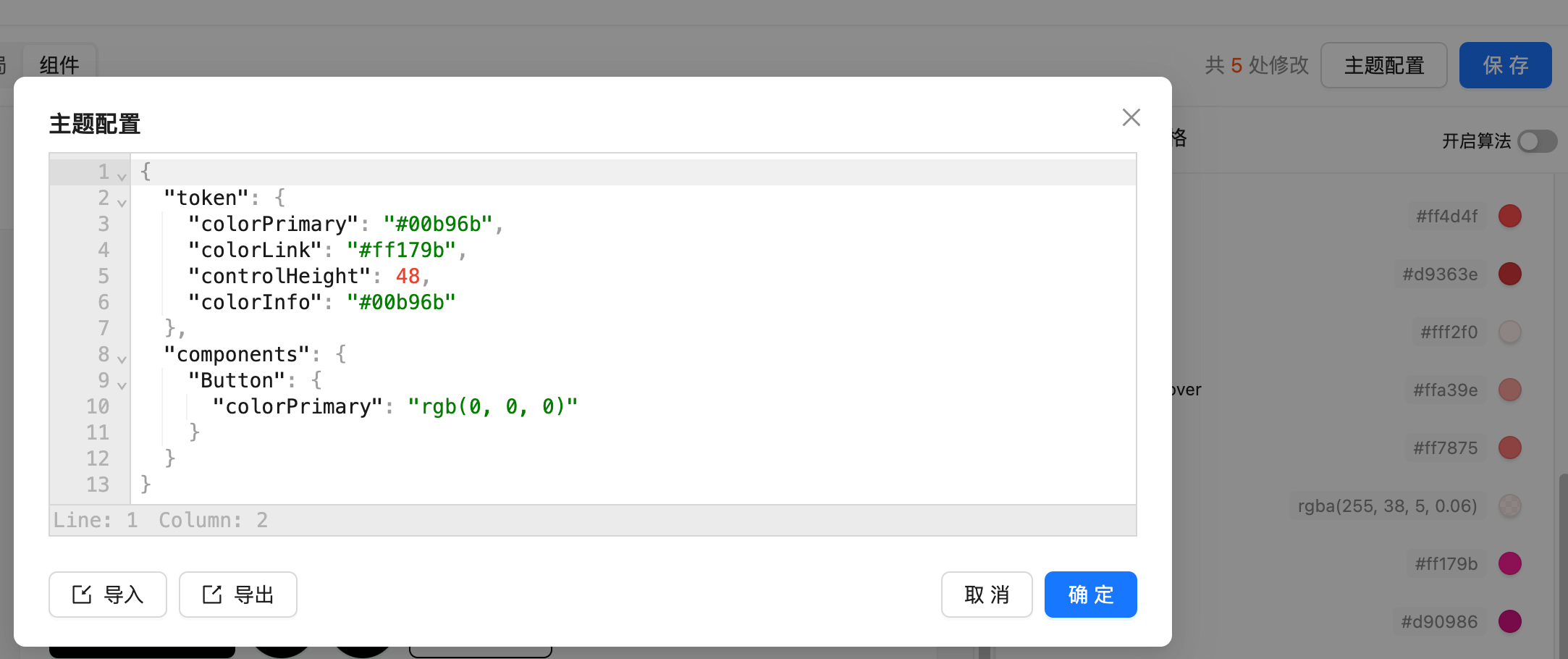
Paste the token and components back into the platform's theme settings:
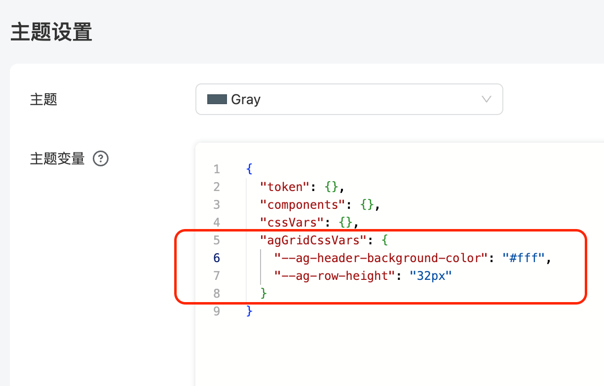
Ag Grid Theme Variables
The Table component uses Ag Grid, which supports CSS variable configurations that can be set in the agGridCssVars property as shown below. The full list of Ag Grid CSS variables can be found in the CSS Variable Reference
Other Global Variables
In addition to the component library settings, there are some global CSS variables that can be customized:
{
  /* Background color of the website page */
  "--page-background-color": "#fff",

  /* Shadow of the Card component */
  "--card-shadow": "rgba(145, 158, 171, 0.2) 0px 0px 2px 0px, rgba(145, 158, 171, 0.12) 0px 12px 24px -4px",

  /* Color of help text below components like Input, DatePicker */
  "--helper-color": "#979797"
}
The above variables are configured in the cssVars property as shown below: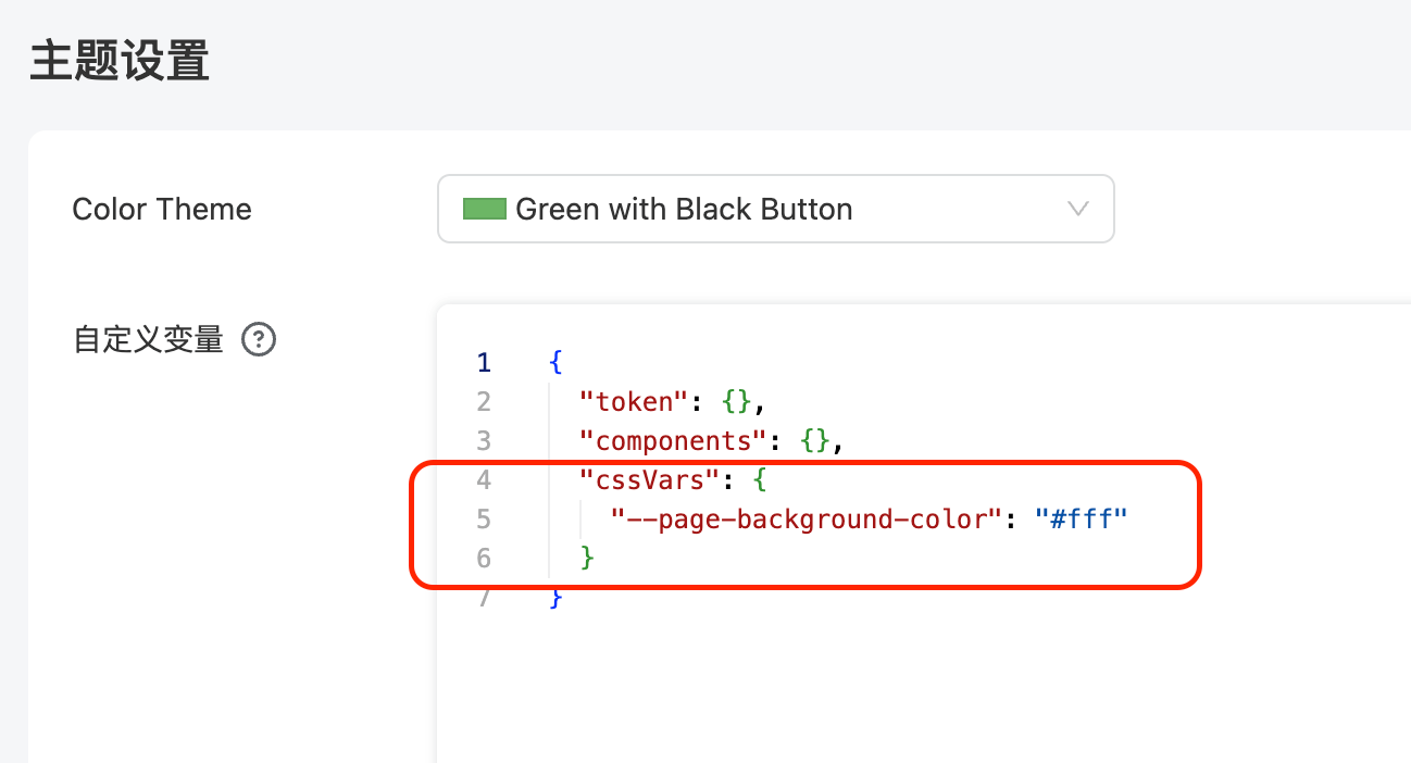
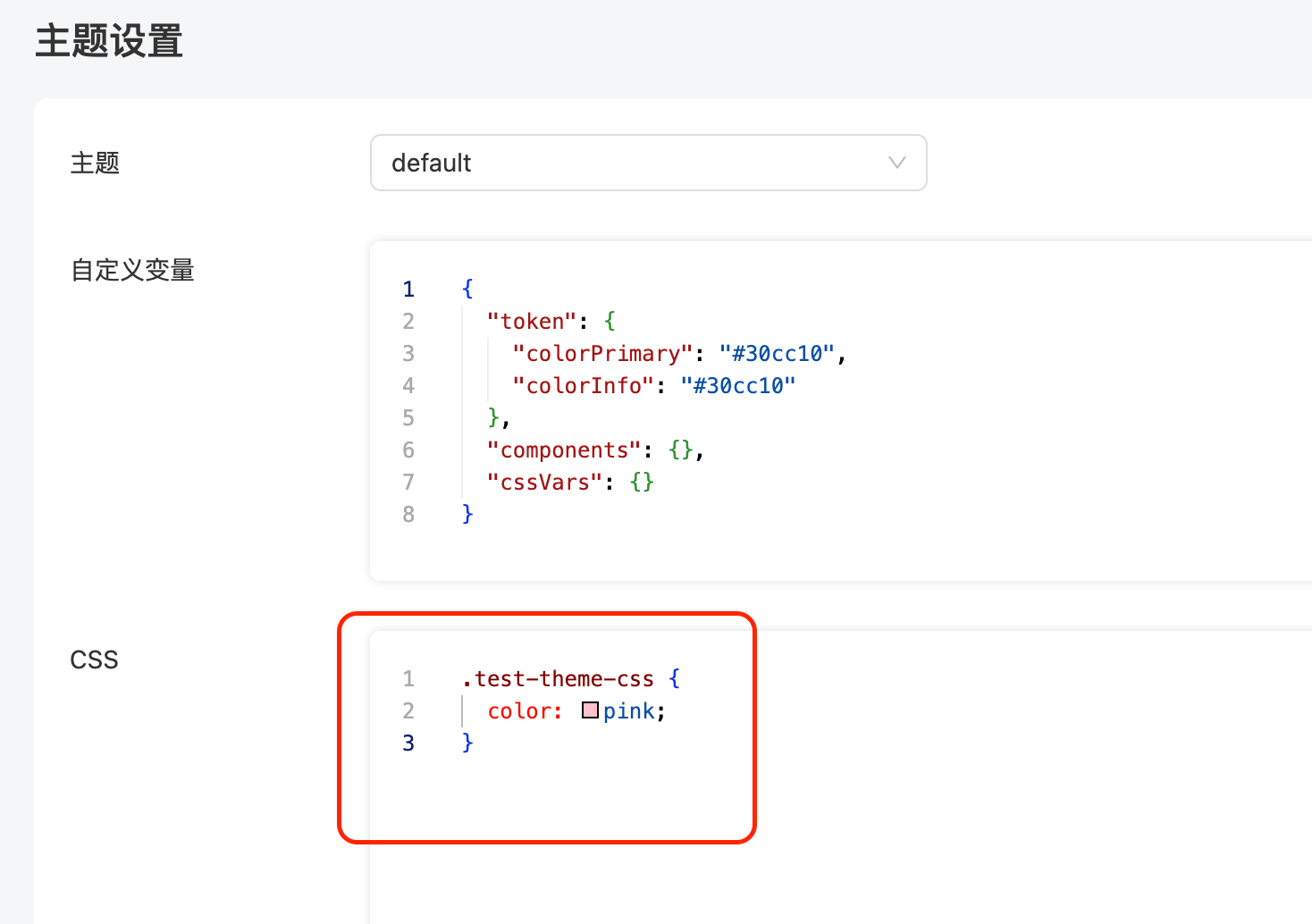
CSS Customization
When the above variables do not meet the customization requirements, you can write CSS in the theme settings to override any styles:
The following video demonstrates how to modify the font size of Tabs to 18px by editing the CSS: