Using Dropdown Selection (Select)
Customizing the Display Content of Dropdown Options
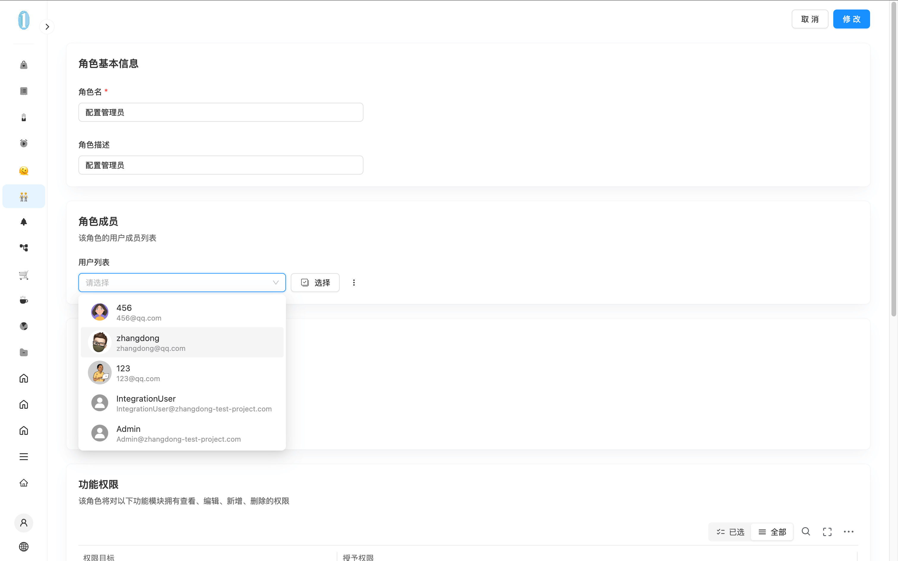
By default, the dropdown options of a Select component display mapping.label. You can also customize the display content, as shown in the example below:
The configuration of Select is consistent with that of ACL for customizing dropdown options. Therefore, the example below uses the ACL component for illustration. :::
The configuration method is as follows:
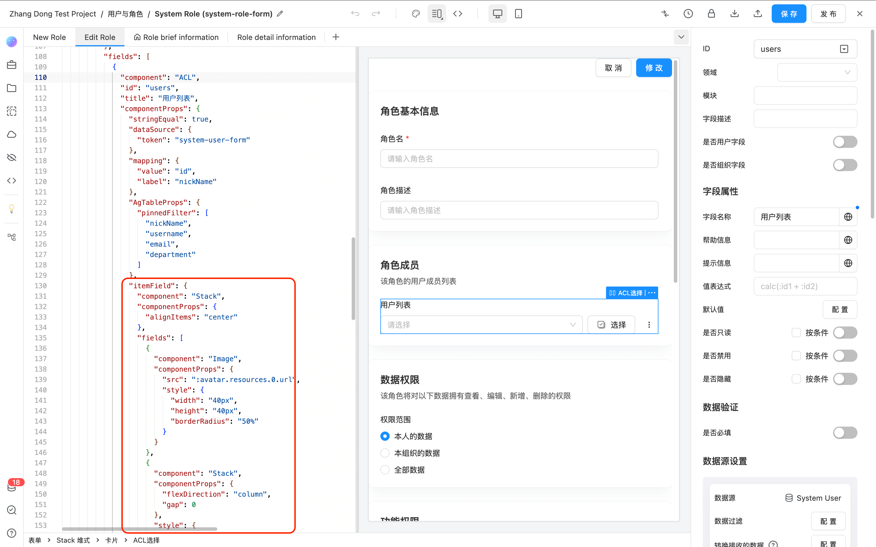
- Open the JSON editing mode.
- In the
componentPropsof the Select component, add theitemFieldproperty. This property can be any system-supported component.
In this example, an icon and the value of mapping.label along with the data ID are displayed. The JSON example for itemField is as follows:
{
  "component": "Stack",
  "componentProps": {
    "alignItems": "center"
  },
  "fields": [
    {
      "component": "Image",
      "componentProps": {
        "src": ":avatar.resources.0.url",
        "style": {
          "width": "40px",
          "height": "40px",
          "borderRadius": "50%"
        }
      }
    },
    {
      "component": "Stack",
      "componentProps": {
        "flexDirection": "column",
        "gap": 0
      },
      "style": {
        "flex": 1
      },
      "fields": [
        {
          "component": "Text",
          "componentProps": {
            "content": ":nickName",
            "style": {
              "lineHeight": "20px"
            }
          }
        },
        {
          "component": "Text",
          "componentProps": {
            "content": ":email",
            "style": {
              "fontSize": "12px",
              "lineHeight": "14px",
              "color": "var(--helper-color)",
              "overflow": "hidden",
              "textOverflow": "ellipsis"
            }
          }
        }
      ]
    }
  ]
}
Replace :avatar.resources.0.url, :nickName, and :email with the corresponding data field references using colon syntax.
API
For the complete Select API reference, please refer toSelect