Using ListSelect
The usage and data format of the ListSelect component are basically the same as the Select component, with the only difference being the UI representation. The following shows the configuration of several different styles of options.
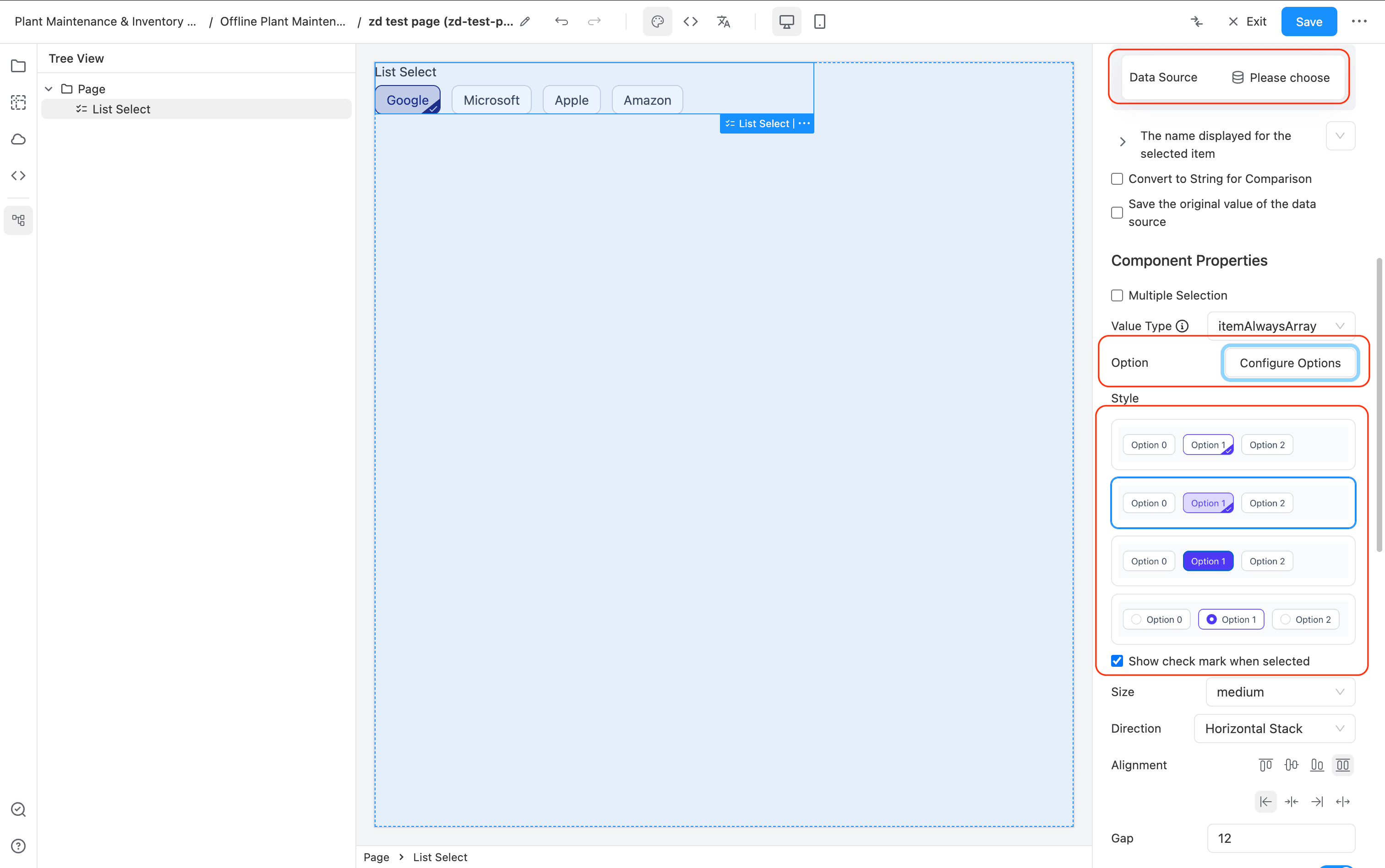
4 Basic Styles
- Option configuration is exactly the same as the Select component. You can configure dynamic data sources or fill them in manually.
- The component comes with 4 display styles, which can be set as needed.
- For the first two styles, you can configure "Show selection checkmark" to display the ☑️ in the bottom right corner.
- The usage is the same as Select; in a form, click to select, and it will be submitted with the form.
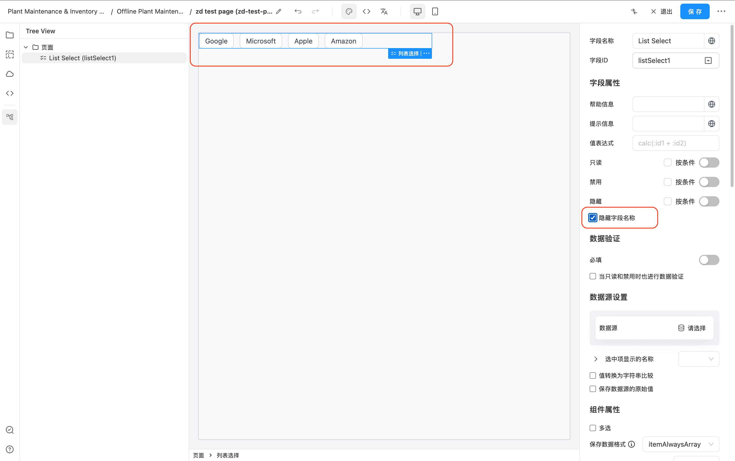
If you don't want to display the field name and only want to show the options, just check the "Hide field name" setting.
Custom Display Content
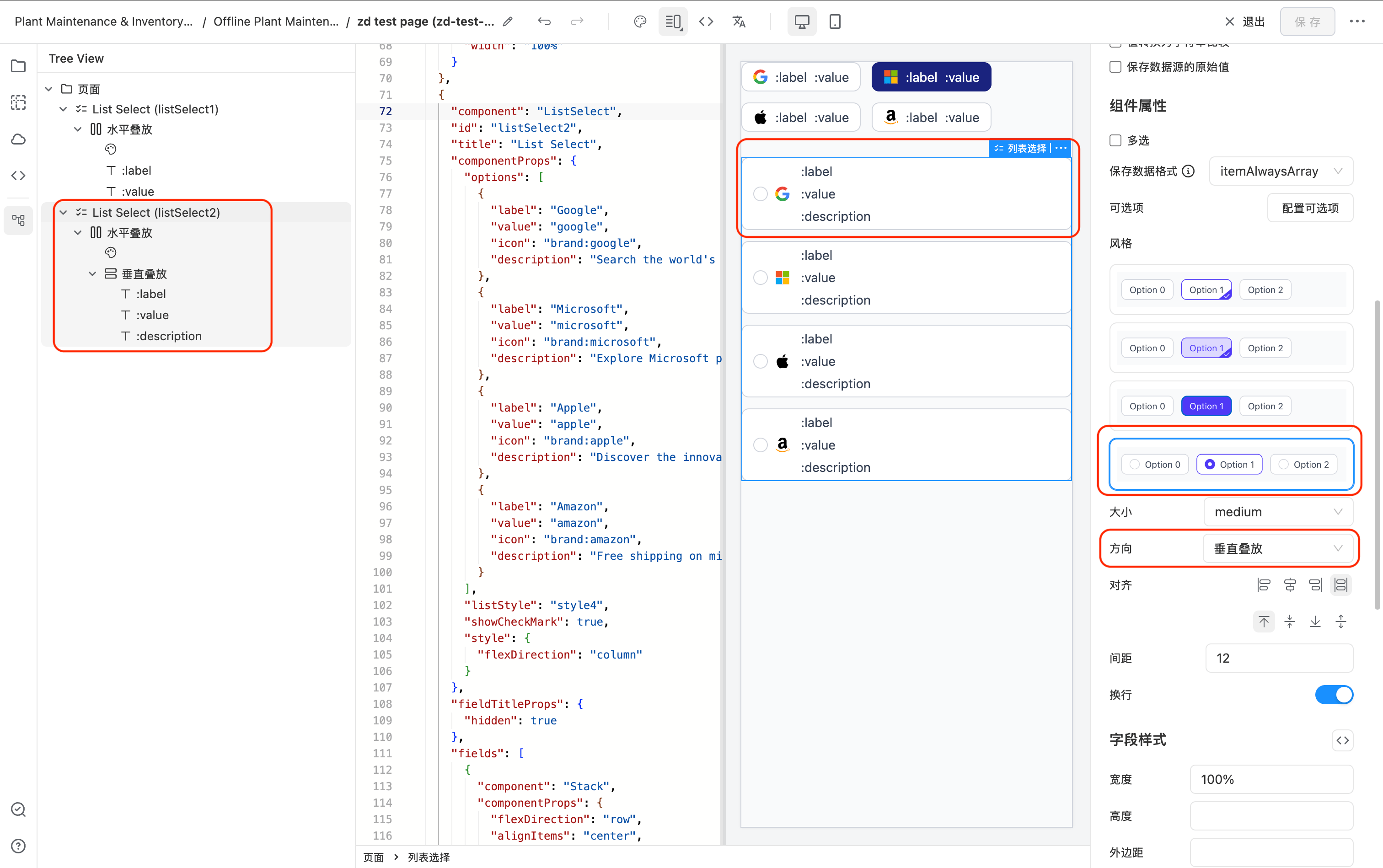
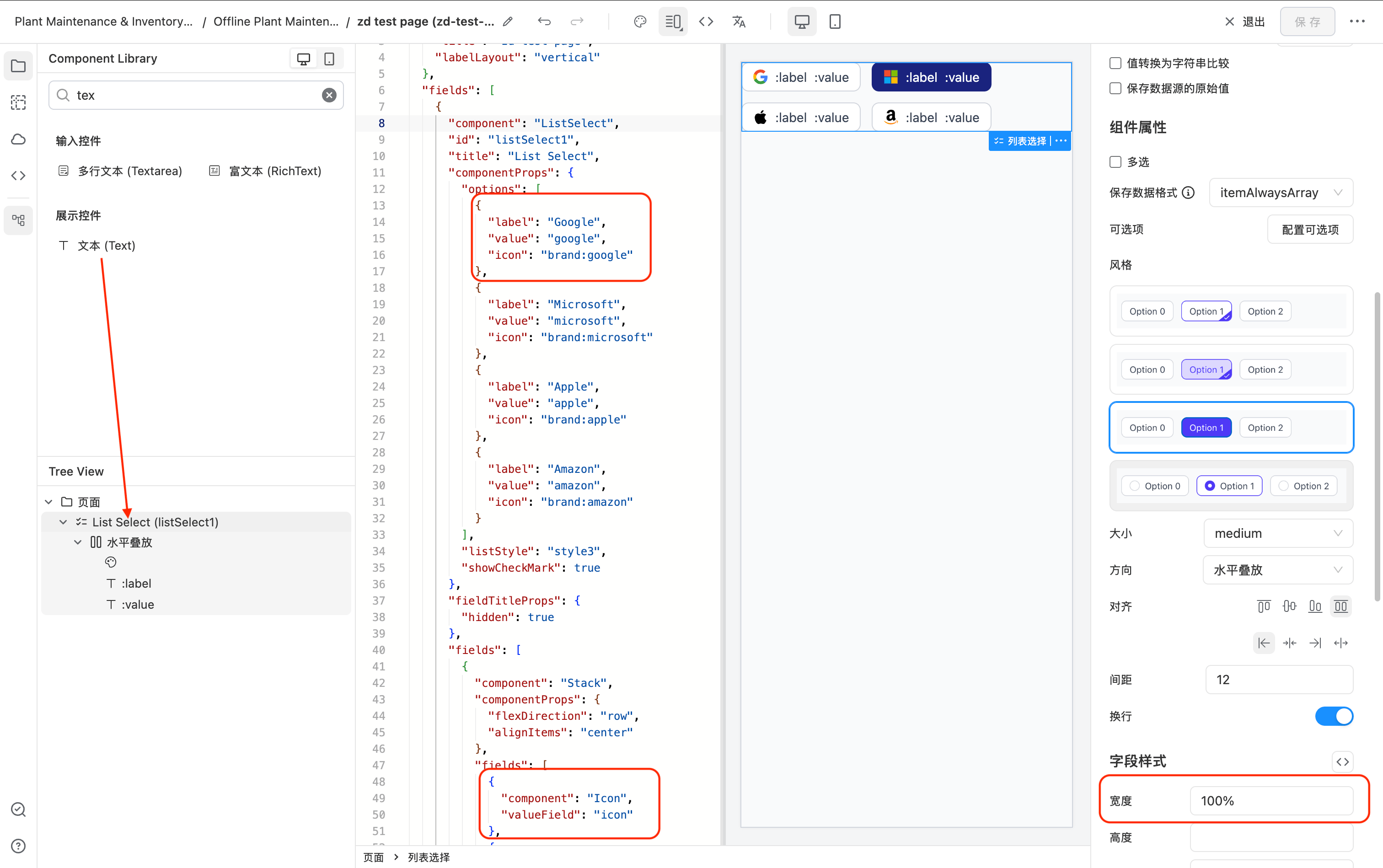
By default, the ListSelect component options display the configured label.
You can customize the displayed content by dragging and dropping. There are no restrictions on the content.
As shown below, I have customized the configuration to display the icon, value, and label simultaneously.
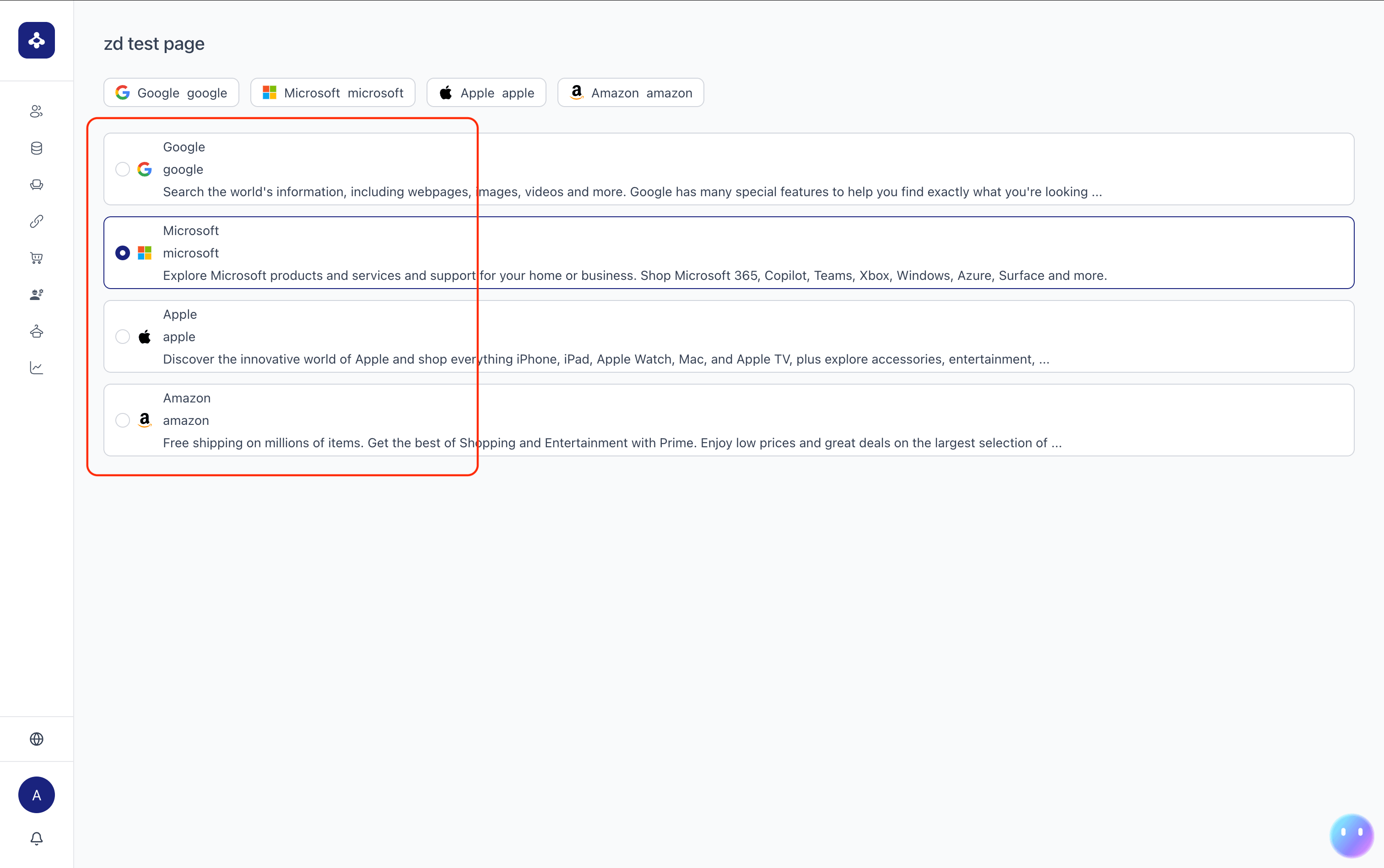
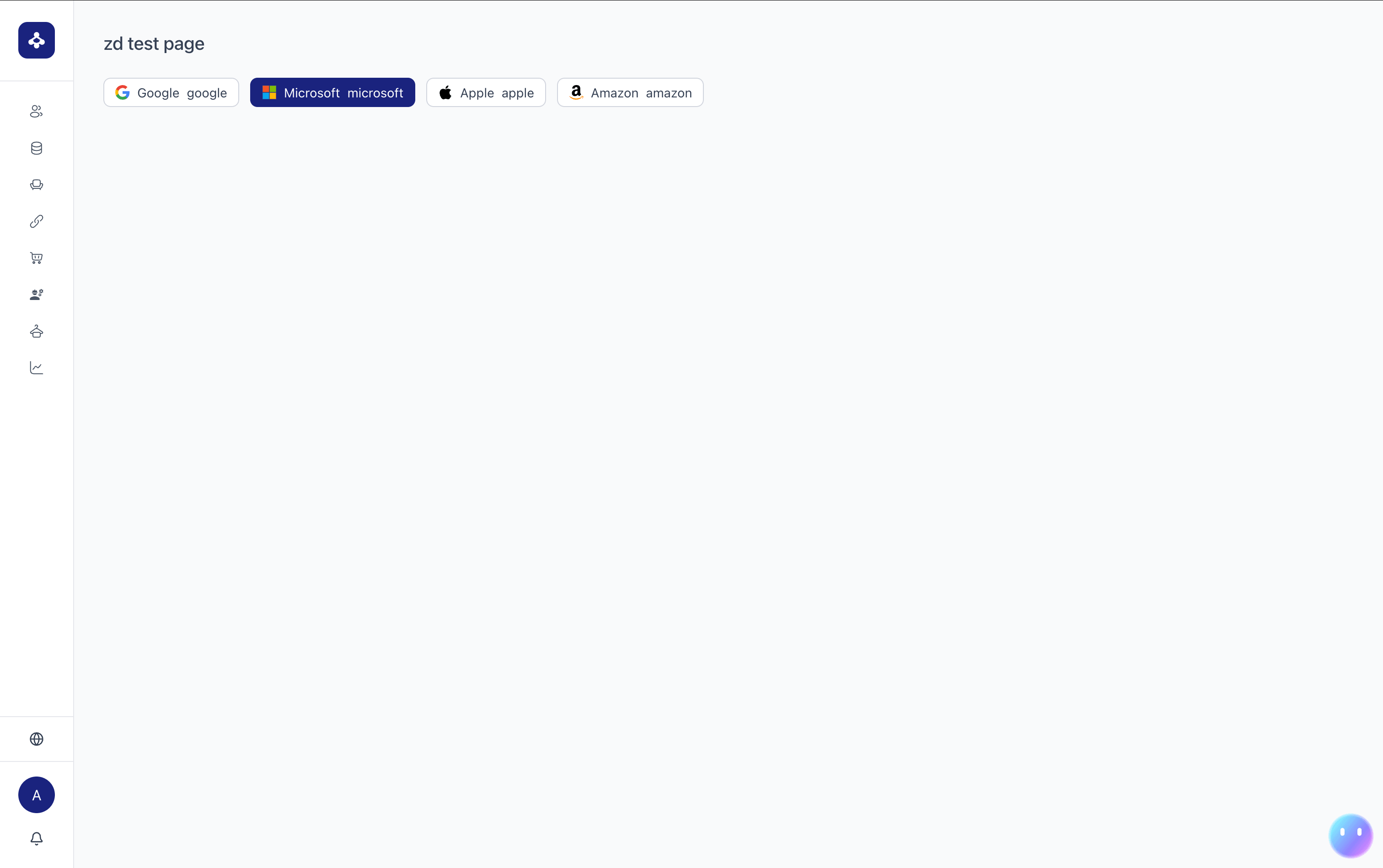
The final runtime display effect is shown in the figure below:
Common Example Configuration 1
Below is a commonly used vertical layout for displaying detailed information in a list selection.